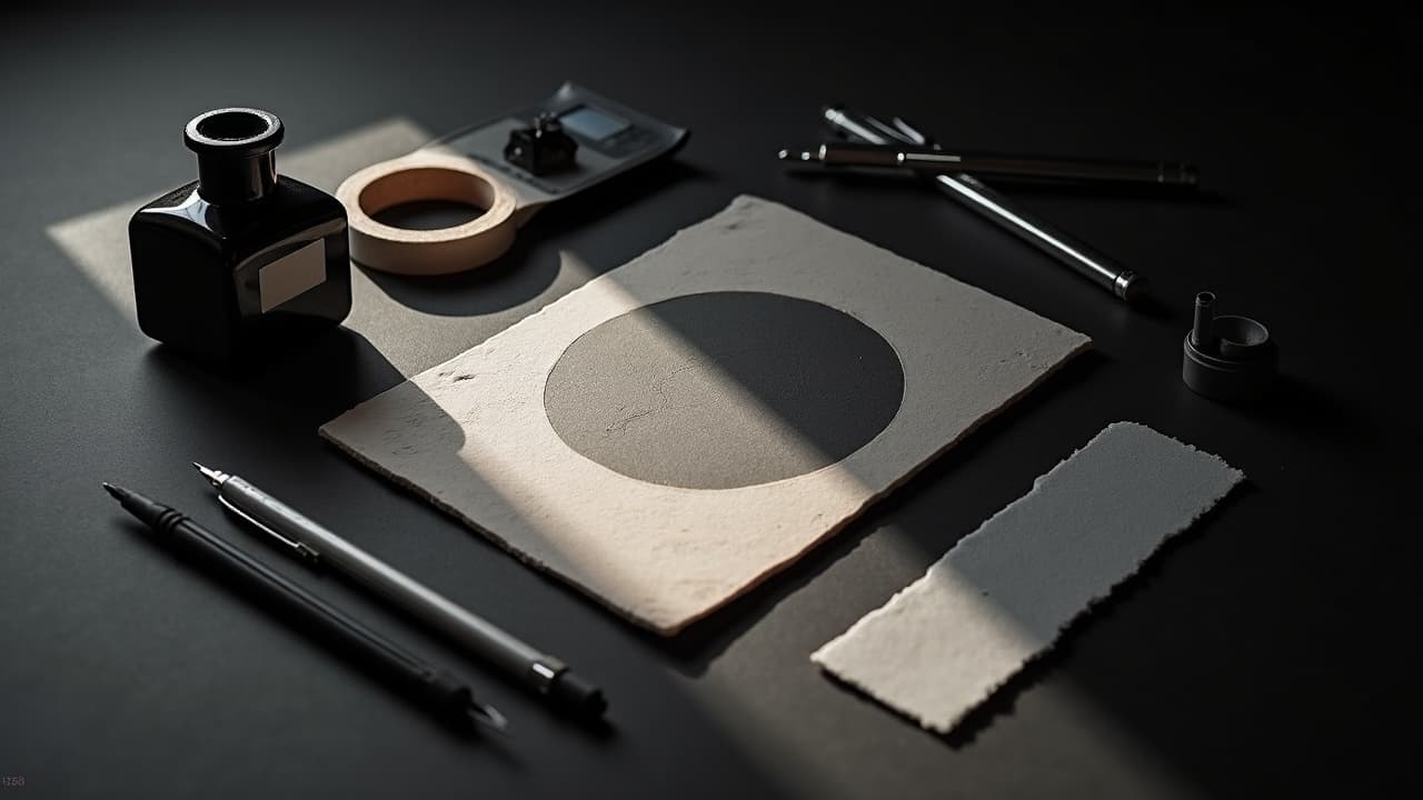
Realistic tattoo prompts are built like lighting diagrams, not adjectives. If your prompt reads like camera notes plus value control, you get designs that stay legible at two feet and still look rich up close. When AI hears vague superlatives, it hallucinates specular glare, infinite pores, and hair-fine scratches that die in the stencil. This guide shows you how to script lighting, texture, and edge hierarchy so your AI outputs look believable on skin and feasible under a coil or rotary.
Build the realism prompt like a shot list, not a poem
Start with a prompt stack that answers seven things in order: subject, composition, lighting, texture, edge control, value map, background. Treat it like a miniature brief a photographer would understand. Then add tattoo-specific constraints so the model respects line weight and negative space. The result is less pretty prose and more production notes the model can actually follow.
- Subject and scale: “wolf portrait, head and shoulders, fills 8x10 in vertical canvas, focal plane eyes and muzzle, ears cropped.” Scale forces the model to prioritize readable forms.
- Camera and lens: “macro 100mm f/2.8, minimal depth of field falloff, no extreme bokeh.” Macro cues tighten detail without inventing crunchy noise.
- Lighting: “3-point lighting, key to fill 3:1, soft Rembrandt key, subtle rim on far cheek, avoid blown specular highlights.” Lighting ratios drive believable value shapes.
- Texture directives: “emphasize microcontrast on fur clumps, suppress random pore-level noise, metal as brushed not mirror, skin as matte albedo.”
- Edge hierarchy: “hard edges for eyes and nose bridge, soft and lost edges on jaw shadow, selective focus on whiskers.”
- Value map: “midtone dominant, compressed highlights, shadows open at 10–15% above absolute black, use ambient occlusion in creases.”
- Background and negative space: “neutral charcoal gradient, no busy elements, clean negative space around silhouette for stencil clarity.”
Texture vocabulary that reads as skin, fur, stone, and metal
AI is great at inventing microtexture, but skin and ink do not support infinite frequency detail. You want coherent texture groups that cluster and taper, not blue-noise sprinkles. Call out the material you want and how it should behave under light, then set limits so the machine does not overcook the file.
- Skin: “subsurface scattering minimal, matte skin, pores only in T-zone, avoid oily glare, freckles soft edged.” Real skin reads as soft, not glassy.
- Fur and hair: “clump into macro clumps 5–10 strands, tapered ends, overlap hierarchy, no flyaways thinner than 0.2 mm.”
- Stone: “sedimentary striations, chipped edges with soft transitions, grain scale consistent, moss as low-contrast stipple.”
- Metal: “brushed metal, horizontal grain, low specular width, scratch density low, reflections blurred to 5–10% contrast, no anamorphic flares.”
Prompt snippets you can paste: “texture discipline, avoid procedural noise, prioritize form over detail,” “material separation via value, not color,” “microcontrast capped at 20% within 5 mm patches.” Keep those caps so the model does not flood the design with glittery nonsense that a needle cannot hold.
Edge hierarchy and line weight the model can follow
Edges tell the eye where to look. In tattoos, edge choices also determine whether your piece heals readable. Name the four edge types and where you want them, and set line weight windows that match your artist’s toolkit. Ask AI for a vector-friendly outline pass so you can export a clean stencil.
- Edge plan: “eyes and key features hard, secondary planes firm, turning forms soft, merge into background lost.”
- Line weights: “primary contour 0.4–0.5 mm, secondary accents 0.3–0.35 mm, internal texture by halftone stippling or crosshatching, avoid micro-lines under 0.2 mm.”
- Stencil ask: “include separate line-art layer, simplify microtexture into dot fields, show value islands with dotted shading maps.”
Shading logic, value maps, and negative space that survive healing
Realism rises or falls on value structure. Script the value map in your prompt, then tell the model how to render gradients using stipple, whip shading, or crosshatch so those tones translate to skin. Preserve negative space where your artist needs breath. Remember that early healing can mute contrast for a bit before settling, and designs with breathing room handle that better. According to the Cleveland Clinic, most tattoos go through a surface healing phase over 2–4 weeks, which is when muddy midtones can briefly look flatter before they reopen.
- Value script: “light source top left, shadow mass under cheek, reflected light at 5–8% above shadow, no crushed blacks.”
- Render method: “simulate whip shading in long arcs, stipple gradients in 30–60 degree bands, avoid airbrush softness.”
- Breathing room: “reserve negative space around focal features, do not fill every gap, keep highlight halos at least 1.5–2 mm wide.”
Color realism across all skin tones
Color reads through melanin and will compress differently across Fitzpatrick I–VI. Ask AI to preview on varied skin tones and to bias color contrast toward value differences, not just hue. Prioritize desaturated earths and clear warms, then let your artist choose inks that hold. The American Academy of Dermatology notes that tattoo pigments can trigger allergic reactions in some people, often with reds, so it is wise to keep a clear separation between high-chroma reds and surrounding neutrals for readability and to reduce overworking an area if problems occur. The FDA’s tattoo inks overview underscores that pigments are not FDA approved for injection, which is a reminder to keep prompts practical and designs efficient so the procedure stays shorter and skin trauma is minimized. Peer-reviewed reporting in JAMA Dermatology also documents tattoo complications in the literature, so color choices that require less layering can be a safer bet.
- Palette ask: “muted palette, anchor values first, chroma second, avoid neon, subtle warm–cool shifts for depth, test on dark and light skin swatches.”
- Hue priorities: “skin-safe illusion with value contrast, use cool shadows and warm lights, reserve saturated notes for micro-accents only.”
- Sun and fade: “design with contrast to withstand UV; maintain darks at 70–80% value so they do not wash to gray.”
Output specs that print, stencil, and scale cleanly
Great prompts die on low-res exports. Specify canvas and output cleanly so your artist can size up or down without mush. Ask for two deliverables: a high-res tonal render and a simplified line or dot map for stencil. Keep margins for placement tweaks on body curves. Avoid fake HDR or sharpening halos, which print as noise.
- Canvas: “portrait 8x10 in at 300–600 ppi, 10% safe margin, export PNG and layered PSD if available.”
- Stencil pack: “separate line-art and halftone layers, dot pitch consistent, no gradients in stencil file, label values light to dark.”
- Proofing: “print at 100% on matte paper, arm’s length test, then 10 inch test. If it reads both distances, it reads on skin.”
Iteration, A/B testing, and reference curation
Realism emerges in small moves. Run A/B tests that change only one variable, like the key–fill ratio or edge softness on the jaw. Curate references that match lighting and material, then feed them to the model with tight captions. Use masked re-renders to fix problem zones without restarting the whole image. For a systematic loop, see our prompt iteration guide and pair it with our contextualization guide to keep subject and setting in sync.
- One-change passes: “same seed, adjust key to fill from 2:1 to 3:1, compare cheek depth and eye pop.”
- Targeted fixes: “mask blown highlights, prompt ‘reduce specular width, keep texture groups,’ re-render face only, keep global values.”
- Reference sync: “collect 3–5 photos with identical light quality, annotate with arrows, add to prompt as style anchors, avoid random mashups.”
Feasibility checks before you send it to an artist
A realism prompt can look great on screen but fail in the chair. Run a checklist against line sizes, ink packing, and healing behavior. If any detail needs a needle finer than your shop uses, simplify at the prompt level first. During the initial 2–4 weeks of healing, micro-lines and whisper highlights are the first to blur, which is another reason to keep a strong value map and adequate line weights. If you plan aftercare with occlusives like Saniderm or moisturizers like Bepanthen, Aquaphor, Hustle Butter, or Mad Rabbit (non-sponsored examples), remember that your artist will tailor instructions to the actual piece. If you plan numbing, discuss it in advance, as some artists allow products like TKTX (non-sponsored example) while others prefer topical-free sessions.
- Minimums: avoid micro-text under 2 mm height, no single strands under 0.2 mm, keep highlight halos 1.5–2 mm wide for survival through healing.
- No-go textures: mirrored chrome, liquid glass drips, and neon bloom. Convert to brushed metal, clean edges, and controlled bloom as dots.
- Placement test: mock up on the actual body curve. Use on-skin previews, then tweak negative space. Try our virtual try-on to catch warping early.
Prompt templates you can modify for hyperreal subjects
Steal these starter blocks, then adapt. Keep the structure and your specific subject, camera, and lighting notes. If you work in color, add a palette line and a skin-tone preview line. For mixed-media realism, reference stipple or crosshatch where gradients must translate to needles. For watercolor realism overlays, pair this with our watercolor layering techniques so washes do not smother your values.
- Black and gray portrait: “elderly sailor, weathered face, macro 100mm f/2.8, Rembrandt key 3:1, pores minimal, crow’s feet soft, beard as stipple clusters, primary contour 0.45 mm, stencil layer included.”
- Animal realism: “jaguar head, eyes forward, 3-point lighting with cool rim, fur grouped into clumps, whiskers hard, jaw shadow lost, background charcoal gradient, print at 300 ppi.”
- Metal and stone mashup: “broken statue bust with brass inlay, stone chips soft edged, brass low specular, value map midtone heavy, crosshatch shadows, negative space around silhouette, separate line layer.”
Ready to see your realism prompt come alive on your skin? Generate a design in minutes with AI for Tattoo, then preview live placement with our virtual try-on. Start with a structured prompt in our creator, iterate fast, and test scale on your body before you book. Try it now in the [creator](/create) and preview with [virtual try-on](/try-on).
Try AI for Tattoo Free