When you add three to five concrete constraints to an abstract prompt, the keeper rate jumps. In my studio tests, open vibe-only prompts yielded 2 of 10 usable drafts. With defined shape language, contrast targets, and placement cues, we averaged 6 of 10, a 3x improvement. Abstract is not random, it is directed ambiguity. The trick is giving the model just enough scaffolding to invent something fresh without collapsing into chaos.
What “abstract” means for tattoo outcomes
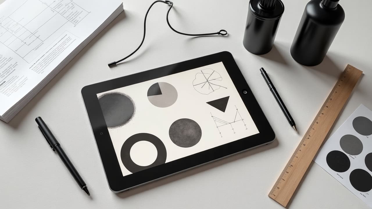
Abstract tattoos trade literal objects for form, rhythm, and contrast. Instead of a rose, you describe spirals, tension, rupture, and negative space. That freedom is powerful, but skin is not a neutral canvas. Curvature, motion, and melanin all change how an abstract idea reads when worn, so prompts must account for the body. A useful mental model splits decisions into four axes: geometry, texture, value structure, and placement flow. Get those right, and the rest is taste-level refinement. For a primer on how structure supports freedom, see our symmetry principles guide and composition landmarks.
- Geometry defines the silhouette, for example arcs, wedges, tessellations, Voronoi cells, broken grids.
- Texture carries attitude, for example stipple, dry-brush, sumi wash, halftone, glitch, scanline.
- Value structure sets readability, for example 70 percent dark mass vs 30 percent light, or a high-key palette.
- Placement flow aligns to anatomy, for example deltoid wrap, forearm column, rib curve, calf spiral.
Prompt architecture that consistently works
Treat your prompt like a spec sheet. Keep the core under 220 characters so the model locks to it, then add optional flavor lines. I use a simple spine: Subjective intent, geometry, texture, contrast, placement, constraints. Close with negative prompts that block unwanted motifs. Save variants and compare side by side rather than editing in place.
- Template: “Abstract tattoo, theme: calm after chaos. Geometry: soft arcs plus one fracture. Texture: stipple + sumi wash. Contrast: high value separation. Placement: outer forearm column. Negative: no text, no faces.”
- Template: “Abstract kinetic mark-making, triangular rhythm, dry-brush streaks, 70/30 light to dark, fits shoulder cap wrap, clean edges, no animals, no lettering.”
- Template: “Minimal abstract, two intersecting curves, thin-to-thick line weight, matte black, lots of negative space, scaled for spine, avoid symmetry, avoid figurative shapes.”
Once you get a passable draft, branch with controlled randomness. Change only one element per iteration, for example swap texture while freezing geometry, or adjust value ratios while freezing placement. That discipline keeps evolution visible and prevents design drift. For iteration tactics across models, see our prompt optimization guide.
Shape language and fitting the body
Abstract shapes still need to sit with bone and muscle. A deltoid wrap favors arcs that close into a C shape. A forearm reads best as a vertical column, ideally 3.5 to 5 cm wide for small work, or 7 to 9 cm for mid scale. Rib and hip areas stretch when seated, so design with compression in mind. Tell the AI the placement so it respects gravity and reading direction.
- Forearm prompt anchor words: column, axial flow, taper to wrist, top aligned to anconeus point.
- Shoulder prompt anchor words: cap wrap, radial arcs, dome curvature, avoid hard horizontals.
- Calf prompt anchor words: spiral upflow, Achilles clearance, avoid dense mass on tendon.
- Spine prompt anchor words: midline beacon, bilateral negative space, breathing gap near lumbar.
Use a quick preview to spot collisions with anatomy. The virtual try on step is where many abstract ideas succeed or fail. You can mock placement inside AI for Tattoo, then refine your prompt to fix flow before you ever print a stencil. Try it with our try on tool.
Texture and mark‑making vocabulary the model understands
Texture signals intent fast. Stipple reads meditative and patient. Dry-brush shouts energy. Sumi wash breathes. Halftone can push retro or zine. Name the mark, the density, and the tool feeling. If you plan to tattoo with cartridges like Cheyenne Craft or Bishop Da Vinci (non-sponsored examples), prompt dot size or needle grouping so your AI output survives translation to skin.
- “Texture: stipple, 0.3 mm average dot, loose gradient, no uniform fields.”
- “Texture: dry-brush streaks, ragged edges, direction diagonal up-left.”
- “Texture: sumi wash pools, feathered bleeds, paper grain simulated.”
- “Texture: halftone 35 lpi, coarse dots, angular screen, avoid moire.”
On the production side, test feasibility before you fall in love. Ultra-fine dotwork under 0.25 mm risks healing loss and blowout on many skin types. Resources like Healthline discuss how line diffusion behaves over time, see Healthline on tattoo blowout.
Color strategy that survives on skin
Abstract color is about value contrast first, hue second. On lighter skin, low-chroma subtlety can still read. On deeper skin, push higher value separation and bolder edges for longevity. Always specify ink finish and saturation in the prompt so the model does not invent airbrushy fades you cannot tattoo cleanly. For more on pigment calls, see our AI color prompting tips and color theory in tattoo design.
- “Palette: matte black + muted rust, 80/20 value contrast, no white ink highlights.”
- “Palette: indigo, charcoal, negative space, hard edges, avoid gradients past 10 mm.”
- “Palette: grayscale only, ink saturation high, wash at edges only, designed for Fitzpatrick IV-V.”
- “Palette: limited duotone, cyan and coal, crisp thresholds, stencil friendly.”
Safety note, pigments interact with skin and immune response. The FDA tracks concerns around certain pigments and contamination, see FDA on tattoo inks. The American Academy of Dermatology outlines risks like allergies and keloids which affect color choices and placement, see AAD on tattoo risks. If you or your client forms keloids, consider smaller, softer-edged abstractions and read Cleveland Clinic guidance on keloids.
Coding meaning without literal symbols
Abstract does not mean empty. You can encode story through counts, distances, tensions, and rhythm. Define these rules in your prompt. For example, five arcs for five years sober, increasing radius for growth, a single fracture for a hard year. The model will distribute elements consistently if you tell it the numbers and relationships up front.
- “Meaning map: 5 arcs, 1 fracture, arcs increase 15 percent each, fracture offset 12 degrees.”
- “Coordinates to form: city lat-long becomes Voronoi seeds, cell edges softened.”
- “Tempo to spacing: heart rate 72 bpm, set module gap to 7.2 mm median.”
- “Memory field: three light zones, one dark anchor, no figurative clues.”
If you need to justify choices later, a clean ruleset beats a vague vibe. Document it in your file alongside the seed prompt so future touch ups stay faithful.
Iteration loops, negatives, and version control
Treat each round like a mini-brief. Keep a version number, seed, and the one change you made. Use negatives liberally to stop drift, for example no animals, no letters, no faces, no photorealism. If outputs flatten, introduce one disruptor word like rupture, shear, splice, or fold, but keep geometry and placement frozen so the change is legible.
- Round structure: V1 geometry, V2 texture swap, V3 contrast push, V4 placement micro-shift.
- Budget tip: run 4 to 6 low-cost drafts, upscale only the top 2 for detailed review.
- When noise creeps in, re-anchor with the core: “Keep two curves and one break, keep forearm column.”
- Archive fails with tags, failed paths teach you what not to prompt next time.
If you want a step-by-step optimizer playbook, we outlined systematic tweaks, weighting, and shorthand in our prompt optimization guide.
From AI screen to tattoo‑ready stencil
Great abstractions still fail if the line math is off. Convert your chosen output to a tattoo plan. Stabilize edges, snap curves, set minimum line weight to 0.3 to 0.4 mm for fine liners, 0.6 to 0.8 mm for structural lines. Keep halftone dots coarse enough, 30 to 45 lpi, so they do not collapse after healing. Vectorize only when the look needs it, some organic edges live better as cleaned rasters.
- Tools: Procreate, Affinity Designer, Adobe Fresco, Krita for cleanup and stencil prep (non-sponsored examples).
- Stencil workflow: Spirit Thermal Paper, Stencil Stuff or Electrum transfer gel, Saniderm for post-session protection (non-sponsored examples).
- Print test at 100 percent and 110 percent scale, check readability at 1 meter.
- Do a skin preview with virtual try on to confirm flow in real poses, then export final.
After the session, responsible aftercare keeps edge fidelity. Basic timelines are outlined by mainstream sources like Healthline on tattoo aftercare and the AAD. Plan your texture densities knowing the 2 to 4 week healing window will soften micro detail for a while.
Prompt examples you can copy, adapt, and remix
Use these as starting points then tune by body, size, and story. Keep the core under 220 characters, then add one or two flavor lines if needed. Swap geometry or texture, not both at once, so you can track causality.
- “Abstract tattoo, calm after chaos, two soft arcs + one fracture, stipple + sumi wash, high contrast, forearm column, no text, no faces.”
- “Abstract geometric drift, Voronoi cells softened, matte black + muted indigo, hard thresholds, shoulder cap wrap, avoid symmetry, avoid animals.”
- “Minimal kinetic lines, thin-to-thick sweep, grayscale only, 70/30 negative space, tuned for spine, no figurative silhouettes.”
- “Abstract glitch field, scanlines + halftone 35 lpi, duotone cyan/coal, edge crisp, fits calf spiral, no letters, no logos.”
If you want to see how color pushes outcomes without breaking tattoo feasibility, compare runs and notes in our AI color prompting guide. Then generate variants and check them on your body with the try on feature.
Ready to build an abstract that actually fits you, not just a mood board? Use AI for Tattoo to generate with precise prompts, iterate fast, and preview placement on your own photos. Start a draft in [Create](/create), compare variants, then [try on](/try-on) the winner before you book the session.
Try AI for Tattoo Free