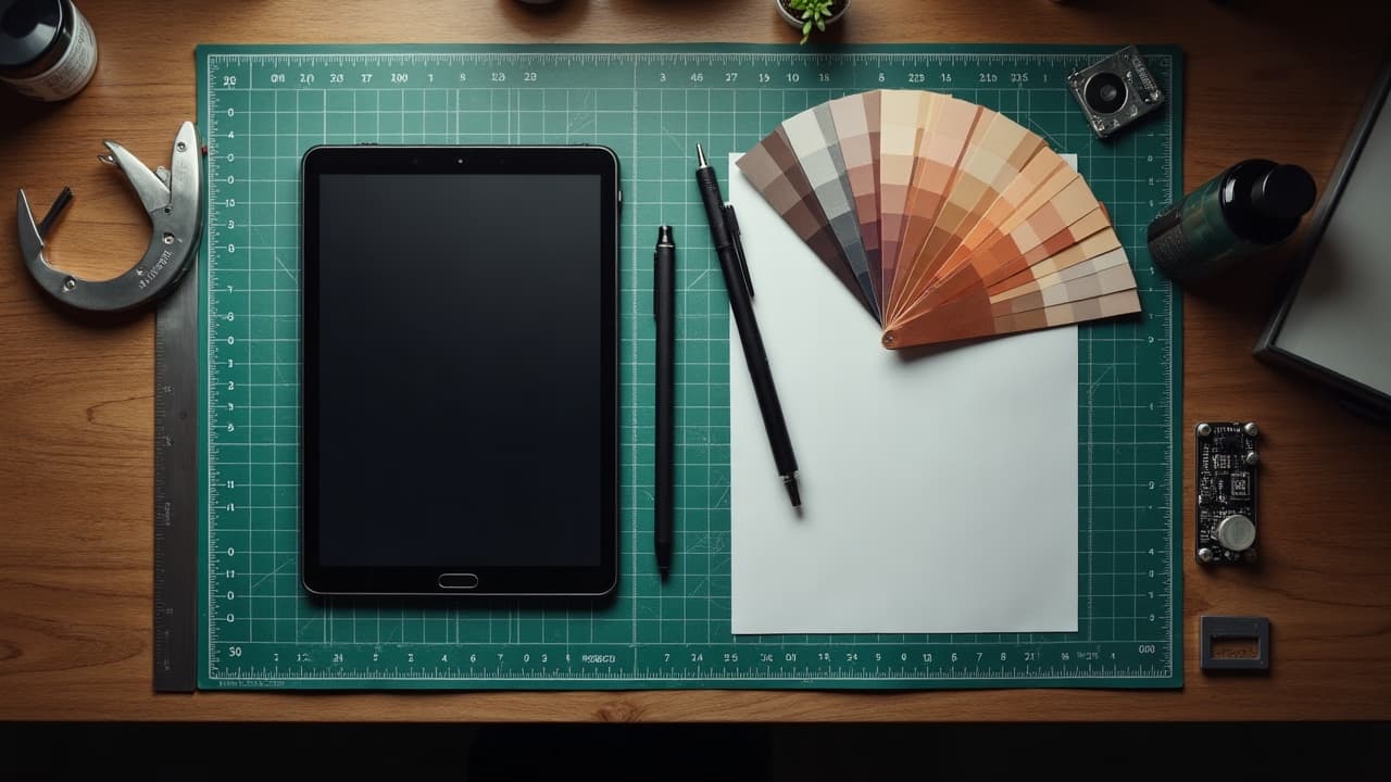
Context beats adjectives. In tattoo prompting, ten precise words like left outer forearm, 18 cm tall, vertical flow outperform forty vague ones about vibes. Give the model the canvas you actually wear, not just the mood you like, and your results immediately look more intentional, more tattooable.
What “contextualization” really means in AI tattoo prompts
Contextualization is not fluff, it is the practical information a model needs to stage a design on a human body. You are telling the AI where this lives, how big it is, which lines must hold up, and what it needs to communicate. Good prompts mix story and constraints so the output reads like a proper stencil candidate, not a poster.
- Personal meaning and symbol set, for example, “rebirth via a phoenix, avoid cliches like tribal sun, include subtle chrysanthemum.”
- Body placement and orientation, like “left outer forearm, vertical axis, starts 3 cm below elbow crease, wraps 25 percent of circumference.”
- Scale and density, specify size in cm or inches, line counts, and negative space such as “18 cm tall, medium line count, breathing room between feathers.”
- Style and technique signals, for example, “American traditional line economy, 5 mm bold keyline, limited palette.”
- Color and contrast targeting, name color palette, contrast targets, and what to avoid, like “olive skin, high contrast, limit pastels, keep blacks warm.”
- Surface notes, scars or cover-ups, include “old black script to mute, faint stretch marks, avoid heavy shading over raised scar.”
- Practical limits, like budget $150–$400, single session, healing window 14–28 days, so the design stays realistic.
If you want to go deeper on semantics for abstraction, see our abstract prompting guide. For composition and flow on real anatomy, bookmark this landmarks article.
Translate your story into constraints the model understands
Meaning drives the iconography, constraints make it wearable. If your story is a memorial for a grandmother who loved gardening and astronomy, do not write “cosmic floral vibe.” Write something the model can map to forms, spacing, and hierarchy.
- Story capsule, “grandmother Maria, gardener and stargazer, calm demeanor, Polish heritage.”
- Symbol shortlist, “lily of the valley, crescent moon, subtle constellation Lyra, no clock imagery.”
- Hierarchy, “moon primary, lilies secondary, constellation tertiary and minimal.”
- Tone, “quiet, not dramatic, avoid skulls or high-gore tropes.”
- Tattooable limits, “forearm, 16 cm tall, medium-thick outlines, shade-to-line ratio about 60 to 40.”
When in doubt, pick two or three symbols with room to breathe. Crowding invites muddiness during healing and touchups. For cultural motifs, use reputable references and be respectful, then confirm with your artist. Our primer on meanings is a good start, see symbols and universal meanings.
Placement, scale, and flow are your power levers
Most generic AI designs ignore limb curvature and motion. Name how the piece should ride tendons or read in a mirror, and the geometry falls into place. Use concrete phrasing that implies fit and flow, not just a location word.
- Forearm template, “outer left forearm, vertical orientation, apex points to elbow, wrap 20–30 percent, avoid crossing inner crease.”
- Upper arm template, “posterior deltoid cap, circular flow, 9 cm diameter, center aligns with mid-deltoid, high negative space near shoulder seam.”
- Back template, “left scapula, diagonal tilt from T3 to T6, 18 by 12 cm, medium density, feather edges into skin tone.”
- Ankle template, “lateral ankle, 5 by 8 cm, avoid Achilles ridge, bold outlines to resist friction.”
Flow words like “follows brachioradialis,” “mirrors collarbone angle,” or “points toward sternum” cue the model to stage the composition. For deeper planning on landmarks and movement, check our composition guide.
Skin tone, contrast, and color direction that hold up on skin
Skin is not white paper. On deeper skin tones, contrast and line weight do more work than low-saturation pastels. On fair skin, cool blacks can read blue, so a slightly warm black with richer midtones looks better. The color palette you name in the prompt should fit the melanin and the long game of healing.
- Fair to light, request “neutral to warm black, muted cool shadows, restrained pastels, no pure white packing except limited highlights.”
- Medium to olive, “warm black, saturated primaries, avoid dusty pastels, emphasize edge contrast.”
- Brown to deep, “high edge contrast, larger color fields, limit faint watercolor washes, focus on silhouette clarity.”
Healing and allergy risk are real. The American Academy of Dermatology notes that reactions can appear months or years after tattooing, especially with some pigments, see AAD guidance. The FDA also cautions that tattoo inks can contain varying ingredients and contaminants, and regulation differs by region, see FDA on tattoos and permanent makeup. These are reminders to keep your color asks realistic and to discuss pigments with your artist if you have a history of sensitivities.
For technique on palettes and model tokens, see our color prompting guide. For practical care that affects final appearance, Healthline’s overview is a useful lay resource, see Healthline tattoo aftercare basics.
Style modifiers that actually change the output
Good modifiers speak like a tattooer. They describe line economy, shading logic, and paper-to-skin translation. Avoid “style salad,” a string of buzzwords that cancel each other out. Pick a lane, then add one or two process tags to anchor the look.
- Effective, “American traditional, 5 mm keylines, minimal crosshatch, 4-color palette, red-black focus.”
- Effective, “single needle feel, 0.25 mm vibe, microrealism 3 cm max height, soft dot shading.”
- Effective, “woodcut hatching, high-contrast blackwork, 30 degree cross lines, no greyscale airbrush.”
- Risky salad, “watercolor, geometric, hyperrealism, anime, tribal, pastel goth” all at once. Split those into separate tests.
- If you want painterly flow, try “watercolor without black keyline, wet edge, light granulation, restrained palette of 3 hues.”
Remember, some styles age better. Fine-line micro text at 2 mm will blur sooner than bold 5 mm script. The Cleveland Clinic has straightforward language on scar formation and keloid tendencies, helpful if you have a history of over-healing, see Cleveland Clinic on keloids.
Technical realism, healing, and line economy
Prompts that output surgical-grade complexity often ignore how skin heals. Build line weight, contrast, and density into your request so the design survives friction and sun. For small work under 6 cm, force simplicity and use silhouette tests. For large work, stage it in readable clusters that can be tattooed in sessions.
- Small tattoo realism, “limit to 2 tones, single motif, outline 0.25–0.35 mm feel, no micro-text below 3 mm.”
- Medium piece, “14–18 cm, medium line diversity, anchor with 3 silhouette beats, keep open skin between clusters.”
- Large work, “sleeve segment, plan in modules, bold keylines 4–6 mm look, secondary lines thinner, high-contrast focal at elbow safe zone.”
- Healing-aware, “avoid heavy packing over flex creases, keep stipple gradual, prefer soft shading over scar tissue.”
Aftercare impacts the look almost as much as the stencil. Call out care-sensitive areas in the prompt, for example “high friction, needs bold lines.” When you do get tattooed, use barrier films and ointments correctly, then moisturize. Products like Saniderm, Bepanthen, Aquaphor, Hustle Butter, Mad Rabbit can help based on artist advice (non-sponsored examples). For medical caution on pigments and reactions, see FDA consumer info. For practical at-home guidance, Healthline’s primers are approachable, see Healthline.
Prompt schemas and before, after examples you can copy
Theme 1, minimal floral. Before, “small delicate flower tattoo.” After, “single lily of the valley stem, left outer wrist, vertical flow toward elbow, 6 cm tall, fine-line look 0.3 mm, high negative space, soft grey dot shading, no color.”
Theme 2, mythic animal. Before, “phoenix rising, watercolor style.” After, “phoenix mid-rise, right outer forearm, 18 cm tall, diagonal from wrist to elbow, high-contrast silhouette, watercolor without black keyline, 3-color scheme, crimson, orange, indigo, avoid pastel washes, leave 20 percent bare skin.”
Theme 3, memorial with astronomy. Before, “grandma memorial flowers stars.” After, “crescent moon primary with subtle Lyra constellation, lilies secondary, calm tone, Polish folk filigree hints, left scapula, 18 by 12 cm, medium density, warm black linework, limited cool shadows, no clocks or dates.”
Theme 4, geometric blackwork calf. Before, “geometric pattern leg.” After, “left lateral calf, vertical ribbon flow, tessellated hex-grid broken into 3 clusters, wrap 30 percent, bold 5 mm outer keyline look, inner hatching 1–2 mm feel, leave channels of skin to prevent clogging.”
Cover-ups, scars, and unique surfaces need extra context
If you are covering old ink, tell the model what you are hiding and its value range. “Old black script, 8 by 2 cm, mid-fade, avoid pure negative overlays” produces smarter camouflage like textured blackwork, botanical clusters, or architectural forms that naturally break noise. For scars, specify type and elevation. “Flat silver scar, 5 cm, OK for light shading” is very different from “raised keloid risk, avoid trauma.”
Dermatology sources remind us that allergies and scarring are variable. The American Academy of Dermatology explains delayed pigment reactions and how red inks can be frequent culprits, see AAD overview. For peer-reviewed context on tattoo reactions, explore publication hubs like JAMA Dermatology. Always confirm with your artist and a clinician if you have a history of keloids or allergies.
If you plan a cover-up, build realistic parameters into your prompt, like “favor saturated blacks and deep greens, introduce texture to break old letterforms.” Then bring the AI result to your consult. This saves time for everyone. For prep checklists, read our consultation guide.
Iteration, references, and cost reality
Iterate intentionally. Change one variable per round, such as line weight only, or palette only. Use short filenames for reference uploads, and caption what you like, for example “prefer petal silhouette, not vein detail.” Keep a version log so you can backtrack if a branch stalls.
- Reference quality, use clear profile or 3-quarter views for animals and faces, avoid heavy filters.
- Budget honesty, write “single session, budget $150–$400, aim for 2 to 3 hours” so the AI keeps complexity in check.
- Friction zones, write “high rub area, needs bold read,” for ankles, wrists, or waistlines.
- Sun exposure, “upper arm with moderate sun, prefer dense blacks, minimal pale yellows.”
You can also preview placement with a try-on to ensure the angle and scale make sense before you book. If the design fails the bathroom mirror test from 2 meters away, simplify shapes and strengthen silhouette. Bring the AI result to your artist and expect edits. A tuned prompt is a collaborative head start, not a final stencil.
Ready to put this into practice on your own skin canvas? Generate a tailored design with context, tell the model where it lives and why, then preview it on your body. Start in the creator at [AI for Tattoo](/create), and drop it onto your arm, leg, or back with our [virtual try-on](/try-on). Small changes in wording, big jumps in quality.
Try AI for Tattoo Free