Most winning AI tattoo designs do not arrive on the first try. They click on pass three to five, once you tighten the brief, trim noise, and aim the model with specifics. Treat prompting like a sketch session, not a single shot, and your keepers multiply fast. Iterative workflows are standard in design because each loop reduces uncertainty and improves fit. That principle applies here too, as any UX team at the Nielsen Norman Group will tell you. If you lock a repeatable loop, document small changes, and judge outputs against tattoo reality, your AI becomes a reliable collaborator instead of a slot machine. Below is a field-tested system for AI tattoo prompts, tuned for ink. It favors clear constraints, small variable moves, and studio-ready deliverables. Use it as a baseline, then adapt to your style and your artist’s preferences.
Build a Tight Iteration Loop
A fast loop beats a long prompt. You want a cadence where each pass answers one question at a time. I use an ICE scaffold, short for Intent, Constraints, and Evidence. Intent sets vision, constraints keep it tattooable, evidence tells you if it worked. Keep each loop to one variable change so you can attribute what improved or broke. Set a quality bar before generating. For linework pieces, that might be crisp 1–2 px implied line edges, high negative space, and zero halftone noise. For color, you might require two dominant hues max, low-saturation skin-safe palette, and balanced contrast.
- Write your Intent in one sentence, like a client brief. Example, “fine-line peony, wrist, minimal shading, breathable negative space.”
- Lock Constraints up front: placement, scale in millimeters, line weight targets, and allowed palette. Tattoo constraints reduce rework later.
- Collect Evidence deliberately. Score outputs on 3 criteria, like “line cleanliness, readability at 100 mm, color discipline.” Keep scores in a simple spreadsheet or notes app.
- Limit each iteration to one change. If two variables shift, you will not know what caused the improvement or regression.
- Save an audit trail. Copy-paste your exact prompt, model settings, and seed into a prompt log so good results are reproducible.
Start With a Grounded Brief, Not Vague Vibes
Vague inputs force the model to guess, which is how you get over-detailed or off-style results. Start every project with a grounded brief that includes subject, placement, scale, style family, and references. Mention how it should read from one meter away. That one detail protects readability. If you need a refresher on context, tuck in with our contextualization guide. For abstract or non-representational pieces, see our abstract prompt guide to keep the vibe focused without losing clarity.
- Subject and action: “red-crowned crane standing, head turned left.” Avoid multi-subject chaos unless you plan a sleeve.
- Placement and size: “inner forearm, 130 mm tall.” Scale demands different detail than a 40 mm ankle micro-tattoo.
- Style family: “single-needle fine line, low shading” or “neo-traditional, bold lines, limited palette.” Do not stack six styles at once.
- Palette rules: “black and grey only” or “two-color complementary palette, low saturation.” Models follow palette ceilings better than open color.
- Reference anchors: 1 to 3 links or descriptive anchors, like “composition similar to Art Nouveau posters” instead of naming living artists directly.
Control Style Without Copying Artists
You can express style through attributes instead of name-dropping living artists. It is better ethics and it iterates cleaner. Swap “in the style of X” for descriptors like bold contour lines, dotwork shading, flat poster color, traditional flash layout, or ornamental geometry. If you mention specific artists or studios, keep it educational, not directive. For an ethics primer, read our tattoo ethics explainer. When the model wanders, add a second sentence that restates guardrails, like “no photorealism, no 3D renders, no gradients.” Those negatives are small but potent.
- Style descriptors that travel: fine-line, engraving, etching, stippling, neo-traditional, Japanese irezumi composition, blackwork.
- Technique illusions: “hand-poked look, sparse dots,” “whip-shaded, soft edges,” or “stippling, mid-density, consistent dot size.”
- Color discipline prompts: “monochrome, warm greys,” or “earth palette, low chroma, no neon.”
- Flash sheet cues: “balanced flash layout, 3–5 motifs, even gutters, silhouette-first readability.”
- Ethics reminder: prefer era or movement labels over living artists. If you must reference, say “inspired by 1970s American traditional” instead of copying a signature style.
Run Micro A/Bs and Grid Searches
The fastest gains come from small, parallel tests. Think like a printmaker setting proof sheets. Generate A/B variations that change only one factor, such as line weight, palette size, background treatment, or camera distance. If your tool exposes seeds, use seed locking to isolate the effect of text edits. For more complex briefs, a tiny grid search pays off. Try three sizes and two palette options at once, then pick the best axis and refine there. Ten fast tests now beat ten frustrating edits later.
- Hold seed constant, change palette: compare black and grey vs two-color to see if color helps or harms legibility.
- Hold text constant, change size: test 90 mm, 130 mm, 160 mm to locate the detail sweet spot for skin.
- Hold placement constant, change background: plain background vs “paper texture simulation” if your model tends to add noise you do not want tattooed.
- Hold palette constant, change line cues: add “thicker outer contour, thin inner details” and compare read from one meter.
- Score each pair on a tiny rubric. Keep only winners, discard the rest without overthinking.
Prompt for Skin Tone, Lighting, and Placement
AI loves neutral canvases. Skin is not neutral. Ask the model to preview on realistic tones and lighting so you can judge contrast honestly. Reference Fitzpatrick types I–VI and set contrast targets, like “works on types III–V, strong silhouette, no fine white ink dependence.” Guidance on skin typing exists in dermatology, see resources from the Cleveland Clinic and the American Academy of Dermatology. Be explicit about lighting, since glare can deceive. “Soft diffuse light, no specular highlights” prevents fake shine that will not exist on healed skin. If you have sun-heavy lifestyle, plan palettes accordingly. UV is a fading force per clinical sources, so low-contrast pastels will age differently than solid blackwork.
- Add a canvas note: “preview on Fitzpatrick IV, indoor soft light” or “Fitzpatrick II, outdoor shade” to test contrast honestly.
- State contrast rules: “bold silhouette, visible from 1 m, avoid white-ink dependence,” which protects readability on varied tones.
- Placement realism: “inner forearm, curvature considered, top aligned to elbow crease” since wrap and orientation change perception.
- Sun exposure reality: if the spot sees a lot of sun, bias to black and grey or dark jewel tones, then maintain with SPF per sources like the Cleveland Clinic.
- If you are sensitive to certain pigments, flag it now, for example “no red-pigment look.” FDA notes allergy concerns with some inks. See the FDA’s tattoos page.
Composition Controls That Survive the Needle
Good composition reads at a glance and holds up at healed size. Tell the model how to balance mass, space, and flow. Use language about negative space, hierarchy, symmetry or intentional asymmetry, and contour emphasis. When in doubt, simplify. Actual needles have physical limits. For a deeper dive on structure, see our symmetry principles guide. Translate tattoo physics into prompt constraints. Minimum line weights, maximum micro-detail density, and contour priorities teach the model to avoid noisy filigree you will later remove anyway.
- Set a minimum detail size: “no elements smaller than 2 mm at 130 mm overall height.” That alone kills most mush.
- Define line hierarchy: “2.5–3 mm outer contour look, 0.5–1 mm inner details,” even for fine-line illusions.
- Balance rule: “60/40 positive to negative space, central focal point, breathing gutters,” which stops overstuffed outputs.
- Flow prompts: “S-curve through the piece, edges feathered into negative space,” helpful for ribs or forearms with natural arcs.
- Lock silhouette: “recognizable black shape at small scale,” then let internal detail play within that silhouette.
Debug the Usual Failures Fast
Most misfires come from the same handful of issues. Build quick fixes into your loop. If edges get soft, tighten language around crisp edges, no gradients, and high-contrast linework. If the model keeps adding backgrounds or 3D shading, forbid them explicitly. Use negative prompts liberally. Keep health and aging in view as you debug. Over-packed micro details blur with time. Dermatology and public health sources, including the American Academy of Dermatology and the FDA, note pigment and skin responses that make simplicity your friend. When in doubt, remove detail before you add more.
- Muddy linework: add “pure line art, no shading, crisp vector feel, no halftones,” and reduce prompt complexity by 20 percent.
- Over-detailing: set a ceiling, “max 5 petals, max 12 scales, no micro-texture,” to force cleaner motifs.
- Weird hands or anatomy: switch to “gestural silhouette, simplified anatomy**, minimal joints detail,” then reintroduce detail slowly.
- Unwanted backgrounds: add negatives, “plain background, no texture, no drop shadows, no glow,” and reward clean winners.
- Text that melts: prefer block capitals, few characters, and strong spacing. Or request a blank ribbon and letter by hand with your artist later.
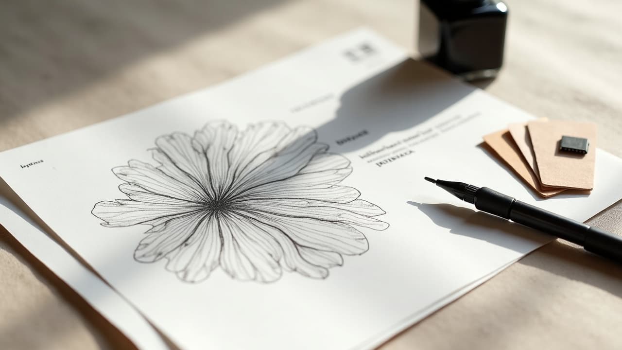
From AI Draft to Tattoo-Ready Deliverable
Do not stop at a pretty PNG. Aim for files your artist can stencil, scale, and edit. That usually means transparent background, clean edges, and a single dominant black rather than seven near-blacks. Bring the right formats to your consult. If you need to clean edges or simulate needle looks, use named tools that any studio can open. Examples include Procreate, Adobe Illustrator, Clip Studio Paint, Krita, Vectorizer.ai, and Affinity Designer (non-sponsored examples). Keep a version with layers so line weights can be adjusted for body size and placement.
- Export two versions: a “presentation PNG” and a “stencil-ready vector or high-res TIFF” at 300–600 dpi for reliable print.
- Test readability at size: print at 100 mm and 150 mm, hang it on a wall, stand 1 m away. Anything you cannot read gets cut or thickened.
- Simulate wrap: place the design on a quick arm or rib mockup. You can use the AI for Tattoo try-on to preview scale and flow on photos.
- Document palette explicitly if color is planned, for example “black, cool grey, muted indigo, no white ink.” Keep a swatch for your consult.
- Bring your prompt log to your artist. It helps them see intent and constraints, and they can flag any red-ink or placement concerns early.
Ready to put this iteration system to work? Open AI for Tattoo, write a tight brief, and generate smart A/Bs in minutes. Use [Create](/create) to spin first passes, then use [Try On](/try-on) to judge scale and flow on your real skin. Iterate with purpose, keep your winners, and walk into the studio with a design your artist can stencil confidently.
Try AI for Tattoo Free