
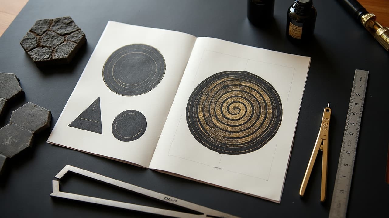
Crisp linework, consistent spacing, and symmetry are what make geometric tattoos read clean from across the room, and those same choices determine how they age. Geometric symbolism is not abstract art-speak, it is a practical vocabulary. Circles speak to cycles, triangles to direction and change, squares to grounding. When your design’s ratios, line weight, and negative space match your intent, the piece feels inevitable, not random. In studio, I treat geometry like a toolkit for clarity. If a client wants balance, I reach for bilateral symmetry and even grid spacing. If they want motion, I pivot to spirals, tessellations, and asymmetry that still resolves. Below, you will find the meanings that most clients actually use, the math that keeps them readable on skin, and the placement choices that keep them aging gracefully.
Geometry, distilled: the shapes and rules that read on skin
Tattoo geometry is a handful of reliable building blocks: points, lines, planes, and the symmetries that connect them. On skin, the winners are simple to name and hard to execute. Bilateral symmetry reads calm. Radial symmetry reads centered. Translational patterns read like rhythm. The body adds curvature, so any perfect shape has to negotiate with muscle and motion. That is why strong negative space is non-negotiable. It keeps forms from collapsing when the arm bends or the ribs stretch. The other quiet hero is line weight. On skin, 0.8 to 1.2 mm lines behave predictably for years, while ultra-fine micro-lines demand meticulous aftercare and realistic expectations. The math is not to impress you, it is to make the symbolism legible: if a triangle is your change symbol, it should still look like a triangle after ten summers and a dozen beach trips.
- Design variables you actually feel: line weight (0.8–1.2 mm for anchors, 0.3–0.5 mm for detail), gap spacing (1.5–2.5 mm keeps clarity), and angle accuracy (keep key angles within ±2 degrees).
- Readable symmetry types: bilateral for balance, radial for centered energy, rotational for movement, reflective for duality themes.
- Contrast that survives: pair solid blackwork anchors with dotwork shade so the piece breathes instead of filling to mud.
- Plan for motion: map over joints with arcs and segment breaks so geometry flexes without warping into blobs.
Core shapes and the meanings clients actually use
Circles, triangles, squares, and hexagons carry meanings that repeat across cultures because they match how we experience the world. A circle reads as cycle, wholeness, sun and moon, breath in-breath out. A triangle can be ascent, direction, or the tension between three forces (mind, body, spirit). Point up signals fire and striving, point down signals water and receptivity. A square grounds, the home, the table you sit at, structure and accountability. A hexagon is the honeycomb, community and efficiency. When you stack, rotate, or interlock these, nuance arrives. A triangle inside a circle feels like intention inside a season. A square framed by circles feels like structure held by community. Your story decides the arrangement, the geometry carries it.
- Circle: wholeness, cycles, cosmos, breath. Double circle suggests protection or boundary.
- Triangle: change, direction, triads. Point-up equals fire/aspiration, point-down equals water/receptivity.
- Square: stability, home, earth. Rotated to a diamond, it becomes movement within structure.
- Hexagon: community, efficiency, nature’s engineering. Links to bees and mutual support.
- Line and point: a single axis reads as path or timeline. A point becomes origin or intention.
Sacred geometry, with context and respect
Patterns like the Flower of Life, Metatron’s Cube, and Sri Yantra enter tattoo flash because they are visually perfect and philosophically loaded. The Flower of Life gestures at interconnection. Metatron’s Cube maps platonic solids and implies order within complexity. Sri Yantra layers triangles to depict the union of consciousness and matter. These are not decorations for everyone, they are living symbols in specific traditions. If you do not have a direct cultural tie, you can still borrow the underlying geometry without claiming the emblem. For example, use radial lattices and nested polygons to speak to unity without stamping a specific sacred diagram. If you choose a sacred emblem, be clear about intent, discuss placement choices that feel respectful, and keep the pattern technically sound so the meaning does not blur.
The math that makes a piece sing: ratios, spirals, tessellations
Two families of math show up in the best geometric tattoos, proportion systems and tilings. Proportion systems include the Golden Ratio 1.618 and the Fibonacci spiral. You do not have to worship the number for it to work. The ratio simply prevents awkward scale jumps between large anchors and small details. Tilings include simple grids, hex tiling, and non-repeating Penrose patterns. On bodies with strong curvature, hex grids flow with muscle, and Penrose tilings feel like ordered motion without a visible repeat. For inspiration, clients often reference M. C. Escher, or artists like Chaim Machlev (DotsToLines), Roxx at 2Spirit Tattoo, and Thomas Hooper, all of whom treat geometry as choreography on skin.
- Math tools artists actually use: compass, calipers, and laser-cut stencils for repeatability.
- Digital prep: Procreate and iPad grids, vector templates, and symmetry guides to mock up wraps.
- Golden ratio in practice: size anchors at 1x and 1.6x so detail does not disappear from 2 meters away.
- Tessellations that wrap: hex tiling for limbs, radial nets for shoulders and knees.
- Stress test: print at 50 percent size and at 200 percent to ensure clarity at distance and up close.
Technique and texture: blackwork, dotwork, fine line, or color
Technique changes the emotional temperature of geometry. Blackwork reads decisive, a full stop. Dotwork breathes and lets gradients feel natural. Fine line can be whisper-soft, but it demands realistic expectations on longevity. Strategic color accents can emphasize axes or nodes without turning the piece into a patchwork. For durability, keep anchors in solid black and use dot shading and muted tones as support. Blowout risk rises when fine lines are pushed too deep or overworked. If a line looks hazy during healing, it might be a blowout, which Healthline explains as pigment spreading into surrounding tissue. See the overview from Healthline on tattoo healing and blowouts for context. Sun is geometry’s main enemy, so plan for lifetime sunscreen on exposed pieces. The American Academy of Dermatology guidance on sun protection is the standard I quote to every client.
Placement, flow, and scale: mapping geometry to anatomy
Geometry thrives when it flows with anatomy. Long axes belong on forearms, shins, and spines. Radial centers look at home on shoulders and knees. Ribs and hips bend and twist, so use arcs and segmentation over hard boxes. Across the chest, use bilateral mirror planes but respect the sternum’s curve. Pain varies by site. Expect 3–5 out of 10 on outer arm and calf, 6–8 out of 10 near knees, ribs, and sternum. Session planning matters, since ruling lines and packing black feel different at hour six. A forearm geometric band can be 2–4 hours. A torso lattice with shading can run 8–12 hours. Full sleeves often reach 15–30 hours across multiple sittings. If you want a primer on how body landmarks change a design’s read, bookmark our placement guide and this piece on tattoo silhouette composition techniques.
- Rules of thumb: place long lines along muscles, not across joints.
- Break patterns at joints with intentional seams so bends look designed, not distorted.
- Keep 1.5–2.5 mm negative space between parallel lines on high-movement areas.
- Test-wrap paper stencils to check readability at rest and in motion.
- If symmetry is the story, center on a bone landmark and mirror off that axis.
Longevity choices: spacing, aftercare, and future touch‑ups
Geometry ages in the gaps. Too little spacing and lines merge. Too little contrast and patterns flatten. I anchor with 0.8–1.2 mm lines and maintain 1.5–2.5 mm gaps in high-movement zones. After the session, keep it clean and protected. Film wraps like Saniderm for 3–5 days, or a thin layer of Bepanthen or Aquaphor for the first 3–7 days, then switch to light lotion. Brands clients mention a lot include Hustle Butter and Mad Rabbit (non-sponsored examples). Expect top-layer healing in 10–14 days, with deeper settling over 4–6 weeks. Long term, sun protection keeps edges crisp. The AAD’s sunscreen advice applies directly here, and the FDA on tattoo inks is worth reading for pigment realities. If a line softens over years, a planned touch-up brings geometry back to focus. See our ultimate guide to tattoo touch-ups for timing and costs.
Build a meaningful geometric brief that an artist can execute
Good briefs pair symbolism with constraints. Tell your artist what the piece must say, where it must live, and what it must avoid. If your theme is unity through change, we might combine a radial lattice with a triangular axis, scale it by Golden Ratio steps, and map it to your shoulder and upper arm. If your story is resilience, a square-over-spiral can read as structure held through motion. For clients who like to experiment visually before booking, digital mockups are gold. Our guide to AI tattoo prompt development for personalization shows how to turn meanings into visuals that respect spacing and flow. You can also browse styles via our styles page to refine preferences before a consult. When you arrive with intent plus constraints, an artist can translate your meaning into clean math that reads on your body.
- Brief ingredients that help: your three key words for meaning, like balance, change, protection.
- Preferred shape family: circles, triangles, squares, hexes, spirals.
- Placement and max width/height in centimeters, plus whether it must wrap.
- Your tolerance for line weight: fine, medium, or anchor-heavy.
- Texture preference: blackwork, dotwork, fine line, or color accents only.
- Non-negotiables: symbols to avoid, cultural emblems you will not use without context.
A quick note on safety and realism. Black geometry is usually straightforward for healthy skin, but any tattoo carries risk of reaction or infection. The FDA’s overview of tattoo inks reminds us pigments are not universally approved for injection, oversight varies by region. The JAMA Dermatology resource on tattoo complications tracks reports of allergic reactions and granulomas, which are uncommon but real. If you have a history of skin reactivity, discuss test spots, aftercare, and sun strategy early. Intent plus math plus care is what makes a geometric tattoo feel inevitable rather than trendy.
Test your symbolism before you book. Use AI for Tattoo to generate radial, triangular, or spiral concepts to scale, then preview placement with the virtual try-on. Start a concept in minutes at Create and size it to your body with Try On.
Try AI for Tattoo Free