
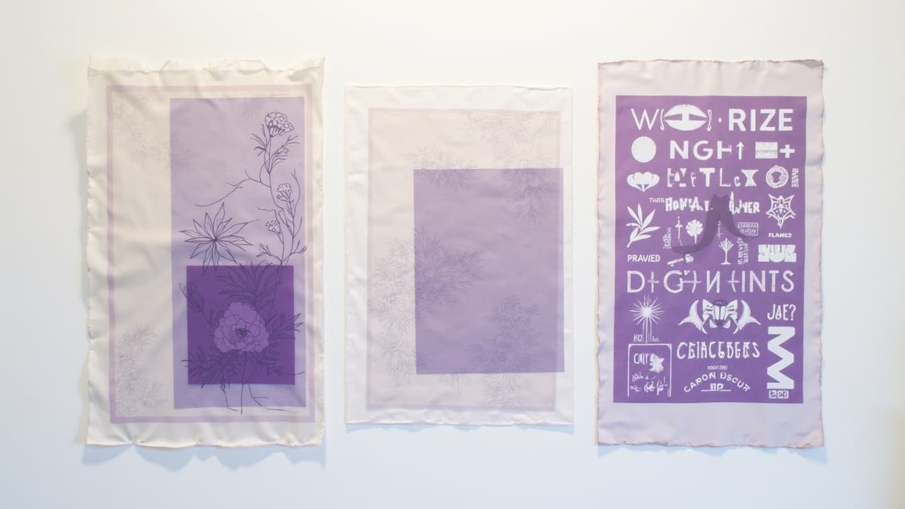
Watercolor tattoos do not rely on water alone, they rely on controlled translucency. The real trick is stacking thin, low-trauma passes at 20–40% saturation so hues stay luminous while building depth. If you understand how pigment sits in the dermis, you can create soft gradients that read like paint, yet hold like a tattoo.
This guide breaks down pro layering moves artists use to get dynamic visuals, from feathered washes to clean negative space. Whether you are designing for yourself or tattooing clients, think in glazes, not fills, and protect the skin like a watercolor paper you cannot replace.
How translucent color actually works in skin
Tattoo pigment rests in the dermis, below the epidermal turnover zone. Light scatters through the skin and bounces off particles, which is why thin layers look transparent and stacked layers look deeper. The more you abrade an area, the more edema you create, which clouds color and invites muddiness. Preserving skin integrity is step one in achieving believable tattoo depth. For a primer on skin layers and wound physiology, the American Academy of Dermatology remains a gold standard reference.
In watercolor style, think like a painter glazing over a mid-tone paper. Your paper is the client’s natural skin tone, your opaque paints are off-limits, and your best friend is negative space. Building from light to dark while leaving skin breaks for highlights is what creates tattoo dimension without harsh outlines.
Build the base: washes, gradients, and low-trauma passes
A controlled base wash sets the temperature and flow. Work with a magnum shader or curved mag, run your machine soft, and ride the top of the dermis with whisper pressure. Move in elongated ovals, not tight circles, to avoid overworking hot spots. I prefer one pass to map the gradient, then a second pass, offset, to even the tone. Keep wipes gentle and use a thin lubricant film so needles glide, not dig.
- Needle picks: CMag 9–13 or bugpin mags for velvety blends, with a 3RL reserved for crisp accent specks.
- Voltage and give: run a soft hit at 6–7.5 V on rotary for smooth washes, increasing slightly for texture passes.
- Dilutions: mix 1:3 to 1:6 pigment to sterile solution for first washes, reserving full strength for accent glazes.
- Hand speed: steady, medium-fast sweeps, then feather out with whip shading to taper a gradient cleanly.
- Surface prep: a micro layer of Hustle Butter or A&D keeps the epidermis supple and reduces drag.
- Wipes: use diluted green soap or witch hazel, dabbing rather than scrubbing to protect the fresh wash.
Layering order that prevents mud: light to dark, warm to cool
Stack sheer colors in a painterly sequence. Start with light values and warm temperature notes, then glaze cooler or darker values on top to push depth. Transparent yellows over skin create glow, oranges pull warmth, then cool blues and violets add recession. Keep complements apart unless you are intentionally mixing a controlled neutral. If you need a shadow, reach for a desaturated violet or teal instead of black to keep the watercolor vibe.
Between passes, let the skin settle a minute or two and lubricate lightly. If plasma is pooling, blot and pause. Over three or four thin glazes the hue should build without chalkiness. For more complex palettes or large flows, map your color path in a thumbnail first, or generate quick studies with our color theory prompt ideas to audition layering techniques digitally before you commit.
Edges that breathe: negative space, soft masks, and lost-and-found lines
Edges sell the watercolor illusion. Keep some edges lost by fading into bare skin, then find others with a sharper glaze or a hairline detail. Reserve negative space rims around petals, clouds, or splashes so forms read without heavy outlines. You can also pull color up to, but not into, a reserved highlight for a convincing wet edge. If a piece needs structure, drop in a 2–3/10 opacity gray scaffolding line that disappears under color but anchors the silhouette. For composition planning, study our silhouette composition guide.
- Hard-to-soft sequence: establish one crisp anchor edge, then graduate opposing sides with feathered passes for motion.
- Highlight saves: leave 1–3 mm skin breaks at light sources and along water blooms to keep sparkle alive.
- Masking by wipe: lubricate the highlight zone and wipe toward it so pigment fades before the edge, not through it.
- Drop shadows: use cool desaturated glazes beneath objects to lift them without black, keeping the airy feel.
Wet-on-wet vs wet-on-dry on living skin
In painting, wet-on-wet creates soft blends. On skin, we simulate it by working while a thin film of plasma and lubricant is present. The needle lands shallower and spreads pigment wider, giving misty transitions. For crisp edges and clean dots, switch to wet-on-dry by blotting fully and letting the skin tack up for a minute before the next pass. Alternate these states intentionally, not randomly.
Keep the skin calm. A micro layer of Hustle Butter, Aquaphor, or sterile petroleum helps, but avoid over-greasing which can trap pigment on the surface and smear tones. Gentle wipes with witch hazel reduce redness. If you feel texture starting to raise, move zones and return later. For wound care guidance, the Cleveland Clinic and Healthline both maintain accessible aftercare overviews that align with what we see in studio.
Pigments, permanence, and preventing fade in watercolor work
Translucent does not mean weak. Choose bright, lightfast pigments that hold at lower saturation. Modern lines like Dynamic Color, Eternal Ink, and World Famous Ink have robust transparent options that glaze beautifully (non-sponsored examples). Match hues to undertones, and avoid stacking complementary glazes directly unless you want gray. For clients with sensitive skin or known pigment allergies, review color ingredients and patch test when appropriate. The FDA’s page on tattoo inks outlines oversight and known risks.
Sun is the watercolor style’s biggest enemy. Advise SPF 30–50 broad-spectrum once healed and lifelong. Vibrant reds and yellows can shift faster, so overbuild chroma slightly during application. For choosing inks that pair well with skin undertones and reduce muddiness, see our ink-by-skin-type guide.
Texture for depth: granulation, splatter, blooms, and brushmarks
Depth is not only value. It is also texture. To mimic watercolor granulation, speckle with a 3RL at low depth and staggered spacing. For splatter, hand-place dot clusters in variable sizes, tighter near the impact point and looser as they radiate. For blooms, glaze a light value, wipe once, then ring with a deeper tint, leaving a thin clear halation. Suggest brush direction by pulling short, tapered whips that start firm and lift off clean.
- Granulation recipe: mix a cool gray or muted violet, stipple irregularly, then glaze a warmer translucent tone over it.
- Splatter control: plant 5–9 varied dots, then echo with faint satellites for a believable spray decay.
- Bloom edges: keep a 1 mm breathe zone between inner light and outer ring so the capillary glow feels real.
- Brushmarks: use a 7–9 curved mag, angle to one corner, and lift to a hairline for painterly starts and stops.
Session strategy: healing windows, costs, and client comfort
Multiple light layers are safer than one heavy burn. For medium pieces, plan 2–3 sessions so the skin rebounds and colors stay clean. Typical healing to top-layer closure runs 10–21 days depending on placement and care. The AAD and Cleveland Clinic both note that full remodeling continues for weeks, so stacking major glazes 2–4 weeks apart is sound practice for large work.
Cost-wise, watercolor layering is time intensive. Expect $300–$800 per session with established artists, more for large custom flows. Pain is usually 3–6/10 on outer arm and thigh, spiking on ribs or ditch zones. Keep clients comfy with clear breaks, light snacks, and breathable wraps like Saniderm for the first day if your protocol supports it. For moisturizers by skin type during heal, point clients to our aftercare and moisturizer guide.
Tools and small choices that add up
A good watercolor tattoo reads effortless because the setup is disciplined. Use bugpin groupings for silkier blends, keep fresh needles on hand for texture switches, and carry multiple dilutions ready. Reliable hardware and inks reduce variables, which lets you commit to soft passes. Consider brands like Bishop or FK Irons for stable rotaries and Cheyenne cartridges for consistent groupings, plus aftercare staples like Bepanthen, Mad Rabbit, and Saniderm to support the finish (non-sponsored examples). For science-based safety background, the Mayo Clinic maintains thorough skin health resources.
Test your layers before the needle. Use AI for Tattoo to generate glazing studies, audition palettes, and preview soft edges on your real skin. Mock up the flow, then try it on with our virtual tool before you book. Start with a concept in the Create studio, then swap placements in seconds. Generate your watercolor concept or try it on now.
Try AI for Tattoo Free