
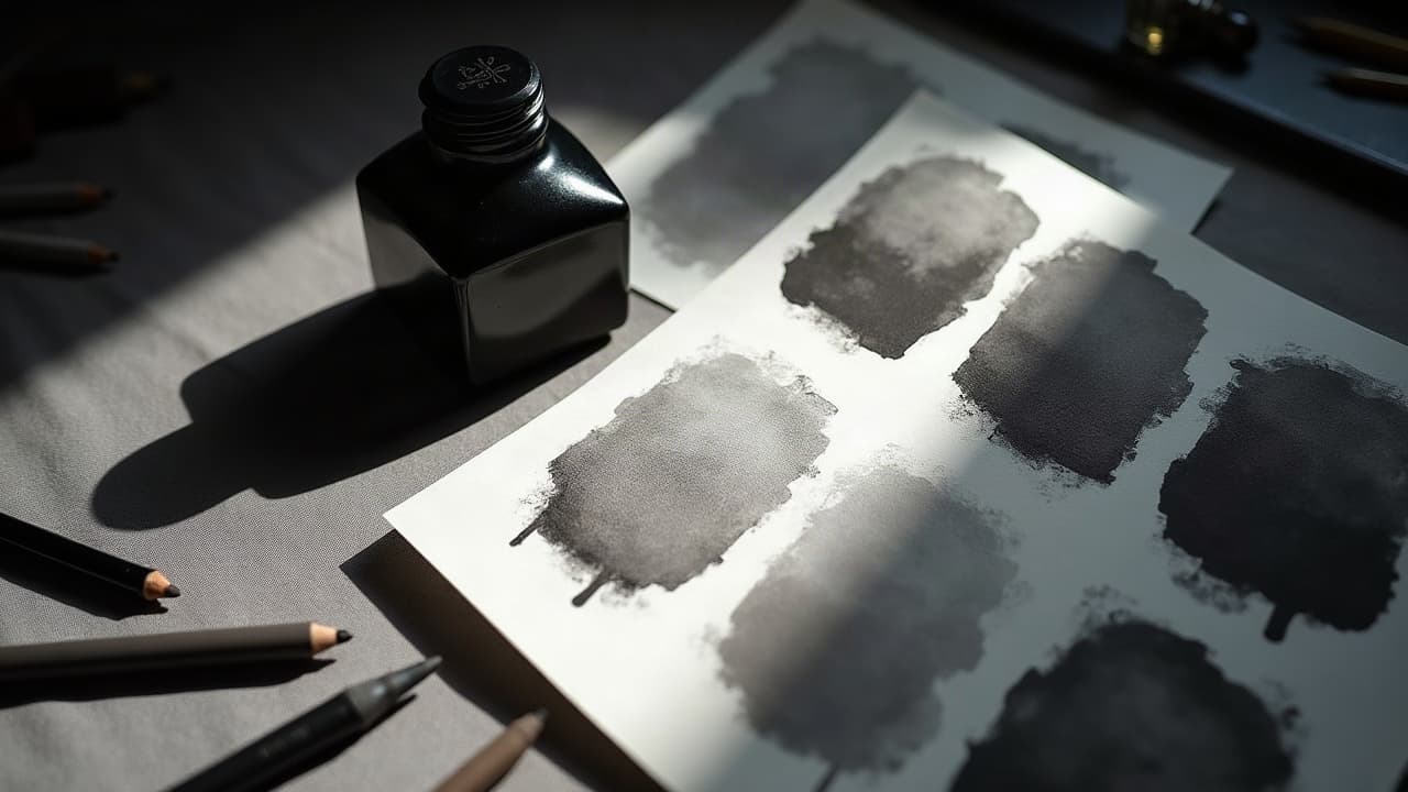
Most viewers read value before line. That is why broad, soft gradients, what many artists call fat shading, will often decide whether a tattoo feels flat or cinematic. When you stack wide, even passes with the right needle angle and wash, you get dimensional form, smoother healing, and a calmer client experience.
What fat shading really is, and why it reads deeper
Fat shading is not about overworking the skin, it is about building large fields of value with magnum needles and controlled motion. You are laying a gradient that transitions from 80–100 percent saturation down to a breathable midtone, then into strategic negative space. The eye interprets those big shadow shapes first, which creates the illusion of depth even before the linework comes into focus. In practice this means lower machine speed, longer strokes, and careful ink dilution so the transition walks, not jumps.
- Tool groupings that excel at fat shading: 7–15 curved magnums, 17–23 curved mags for larger fields, and soft-edge flats for rectangular planes.
- Machine choices: low-vibration rotary pens such as Cheyenne Sol Nova, Bishop Wand, or FK Irons Flux for even drive (non-sponsored examples).
- Needle angle: 20–30 degrees off the skin for smoother blends, steeper only when you need tighter packing on the shadow core.
- Duty cycle and voltage: 6.0–8.0 V on many rotaries for shading, slower than lining to let the needles whisper, not bite.
Setups that keep gradients clean and wide
A fat gradient is only as good as the setup behind it. Prioritize needle stability, consistent wash, and surface glide. Many artists build a dedicated shading tray with three to five gray wash cups, a pure black, and a rinse. A simple split like 20, 40, 60, 80 percent plus straight black covers most needs. For glide, a thin film of Hustle Butter or Vaseline reduces friction without flooding pores. Keep paper towels slightly damp to lift excess pigment gently.
- Cartridge picks: Cheyenne Craft Mags, Kwadron Curved Mags, Da Vinci V2 Mags, all in curved tips for softer edges (non-sponsored examples).
- Grips and balance: a 32–38 mm grip helps relax the wrist, longer reach improves pendulum strokes on ribs and thigh.
- Wash consistency: pre-mix with distilled water and a drop of witch hazel or glycerin to slow drying so blends do not chalk out.
- Stencil protection: a light wrap of plastic film around the hand keeps petroleum products from smearing placement lines.
Technique cheat sheet, speed vs softness
Different motions build different textures. For fat shading you want speed control and repeatable arcs. Start with a pendulum stroke to lay your midtone, then backfill with soft circulars to even the grain, and finish edges with a whip-out so the shadow feathers into unworked skin. Keep the skin taut in three directions and watch your hand pressure, not just voltage, to prevent hot spots.
- Pendulum shading: long arcs, consistent overlap, ideal for cheeks, biceps, and thigh curves where you need a sweeping gradient.
- Soft circulars: tiny, overlapping circles at low hand speed, great for smoothing blotchy areas without overpacking.
- Brush shading: angled mag, paint-brush motion, builds rectangular volumes like stone slabs or architectural elements.
- Whip shading: controlled flick from dark to light, perfect for hair, fabric folds, and petals that need airy ends.
- Stacked passes: two or three light layers, drying 60–90 seconds between, instead of one heavy pass to reduce trauma.
- Pepper shading: for textured moods, alternate a dilute wash with 3RL dotting to add grain inside a fat shadow.
Building emotion with value, the psychology of shadow
Value is mood. High-contrast chiaroscuro pushes drama, tension, and focus, while low-contrast low key values feel calm and intimate. If the story is grief, a deep shadow that clips to near-black 90–100 percent around the focal element creates a visual hush. For serenity or nostalgia, keep the darkest notes closer to 60–70 percent, then open large negative spaces so the skin breathes. Placement matters too. Shadows that fall with the body line, like an oblique thigh gradient, read natural and confident. Cross-current shadows, like a horizontal block on the ribcage, feel challenging and confrontational.
Emotion also rides on edge quality. Hard edges shout. Soft edges whisper. In portraits, fat shading with two-step edge control, a firm core and a diffused halo, lets the subject feel present without looking cut-out. This is where pre-visualization helps. Map your value plan in advance and rotate the stencil on the body until the shadow flow supports the feeling you want. For planning psychology and prompt language, see our prompt intent guide.
Style-by-style applications that love fat shading
Some styles absolutely thrive on wide gradients. Black and grey realism needs fat shadows under cheekbones, jawlines, and clothing folds. Neo-traditional relies on big shade balloons that sit behind bold lines. Japanese irezumi breathes through expansive wind and water shapes that benefit from 17–23 mags. Illustrative pieces use fat shading to set atmospheric perspective, pushing background trees low value while keeping faces high midtone. Even geometric tattoos gain depth when you float shapes on a soft ground instead of raw skin.
- Black and grey portraits: core shadows at 80–90 percent, soften with a 40 percent wash into the zygomatic and neck planes.
- Neo-trad florals: base the petal bowls with whip-to-pendulum passes, leave crisp highlights near the liner edge for snap.
- Irezumi background: build suji lines first, then circular mags to fill wind bars, always with consistent directionality.
- Geometric fades: mask with skin breaks, then brush-shade under the pattern so shapes feel lifted from the surface.
- Watercolor hybrids: pre-soak with healed-friendly 20 percent wash, add color glazes lightly so the gray base sets the mood.
Composition and placement, planning fat shading on the body
Shadows are architecture. On cylindrical forms like forearms and calves, fat shading should wrap, not ladder. On flat planes like shoulder blades, let shadows drift diagonally so they catch light realistically when the arm moves. Use your phone’s light at 45 degrees during stencil placement to preview how a fat gradient will sit in motion. On small canvases, place the darkest field behind the focal element so it stays legible from 6–8 feet away.
- Forearm outer: forgiving skin, pain 3–5/10, long pendulum strokes sit clean over the brachioradialis.
- Thigh: large canvas, pain 2–4/10, ideal for 17–23 mags and atmospheric backgrounds.
- Upper back: broad, stable, pain 3–6/10, great for symmetrical gradients that anchor a centerpiece.
- Ribs: mobile and thin, pain 7–9/10, shorten strokes, lighten pressure, and stack more passes instead of packing hard.
Color, gray wash, and skin tone, getting values that hold
Not all skin reads the same. On deeper complexions, lean into shape and contrast, reserving true blacks for anchors and using deliberate negative space for highlight. On lighter complexions, you can ride more midtone, but still protect highlights so the healed result does not flatten. For recipes, mix gray wash in tight steps, keep your carrier ratio consistent, and remember that healed skin often shifts one value step lighter. The American Academy of Dermatology notes that skin of color may be more prone to keloids and pigment issues, so design with contrast that remains legible after healing. See AAD guidance on skin and tattoos for fundamentals.
If you are planning a design for melanin-rich skin, pick bolder shapes and test a healed swatch if possible. Our deeper dive on this is here, in our skin tone tattoo guide. For color work, fat shading can be your underpainting. Lay a soft gray scaffold first, then glaze transparent colors so the gradient persists after the brights settle.
Session logistics, comfort, healing, and budget reality
Fat shading typically feels different than lining. Clients describe it as a 3–6/10 compared to lines at 4–7/10, since the mag distributes pressure. Plan longer but calmer passes, then short breaks to let the wash absorb. For larger gradients, expect 2–4 hours per session, with total project costs around $150–$250 per hour depending on studio and market. If you use a numbing cream like TKTX or Zensa, apply correctly and patch test first.
Healed results decide success. The Cleveland Clinic outlines that normal tattoo healing takes about 2–4 weeks for surface recovery, while deeper settling continues for several more weeks. See their overview at Cleveland Clinic’s tattoo care resources. Large shaded fields can look milky during week one, then clarify around days 10–14. Avoid aggressive exfoliation. Wraps like Saniderm help reduce friction and scabbing for many clients. For moisturizers, Aquaphor, Bepanthen, or Mad Rabbit are common picks, used thinly to prevent pore congestion (non-sponsored examples). Health information on risks and aftercare is well summarized at Healthline’s tattoo hub.
Ink choice matters for safety and longevity. The FDA has published advisories on tattoo inks and reported reactions. Black pigments can vary, and some colors carry higher allergy risk. Read labels, know your supplier, and document the brand and lot number for the client’s records. For a medical literature view, browse JAMA Dermatology coverage of tattoo complications at JAMA Dermatology on the JAMA Network.
Common mistakes that flatten, and how to avoid them
The biggest error is packing one heavy pass and calling it a gradient. Skin wants layered passes, not brute force. Over-mixing washes is another trap. If your 40 and 60 percent look identical in the cap, you will get mud. Keep your hand travel consistent. If the stroke slows mid-arc, the skin will grab too much pigment and leave a hard step. Finally, respect highlights. Guard them with petroleum before you get close so they remain true skin tone, not accidental midtone.
- Avoid tunnel vision, constantly step back at arm’s length to judge the big value shapes.
- Do not over-saturate edges, finish with whip-outs that fade beyond the shadow mass.
- Map contrast, set your darkest note and stick to it, do not chase deeper blacks late-session.
- Let skin rest, rotate zones every 15–20 minutes so swelling does not fight your blend.
Plan with previews, then commit with confidence
Before you book time, mock the value plan at scale. Photograph the placement area, overlay your design, and paint two to three fat shading options. Try a high-contrast and a mid-contrast route. This lets you pick the mood that matches the story. If you are not sure your idea will read on the body, generate multiple value passes and compare on-device under different lighting. For concept building with mood-first sketches and prompts, see our abstract design guide.
Ready to see how fat shading changes the entire feel of your piece? Use AI for Tattoo to generate grayscale value studies in seconds, then try them on your own body. Build concepts in Create, preview placements with Try-On, and walk into the studio with a value map that already works.
Try AI for Tattoo Free