
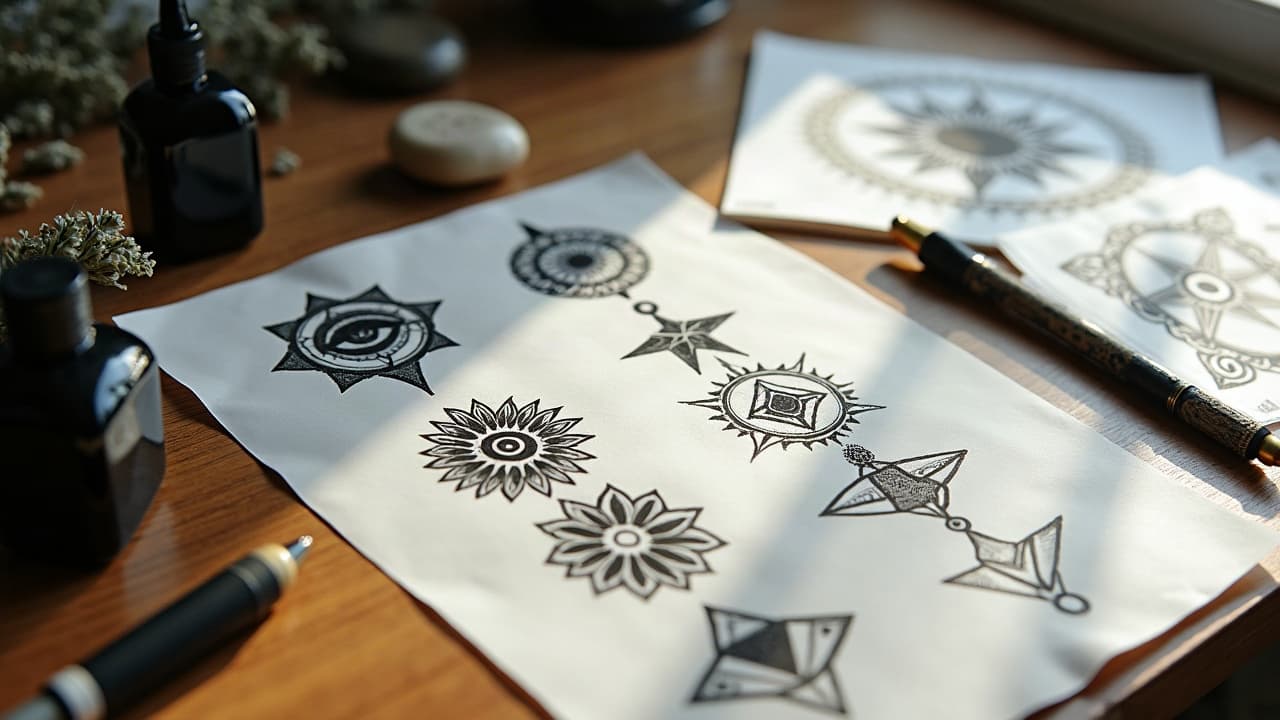
The most legible symbolic tattoos are built in layers. Done well, a chest emblem can read instantly at a glance, then reveal hidden motifs when someone moves closer. Layering decides which idea speaks first, how supporting symbols harmonize, and how the whole piece sits on your body so it stays clear for 10+ years of wear.
Start With Narrative Hierarchy, Then Design Backward
Every meaningful tattoo needs a primary motif that owns the first read, supported by secondary motifs that expand the story, and tertiary details that reward close viewing. Think of it as foreground, midground, background. If your anchor is a phoenix for rebirth, maybe the secondary tier is constellations tied to a date, and tertiary marks are ashes worked into textures.
- Write a one-sentence purpose. Example, “Phoenix honoring my 2022 recovery.” Keep that sentence visible while sketching.
- Pick one primary motif only. If you have two, merge them or demote one to secondary to avoid visual conflict.
- Assign scale by tier. Primary should be the largest shape, secondary at 40–60% of that, tertiary at 10–25%.
- Limit symbol count. A practical cap is 1 primary, 2–3 secondary, 3–7 tertiary motifs for medium pieces.
- Plan reading order. Left-to-right on forearms, top-to-bottom on thighs, spiral around joints. Direct the eye with curves and contrast.
If you like comprehensive multi-theme builds, read our companion primer on theme layering for complex designs. It pairs well with symbolic work where several ideas must live in one cohesive frame.
Use Line Weight To Set Edges And Emphasis
Line is the first depth cue most viewers notice. Reserve a bold 1.5–3 mm outline for the primary motif, medium 0.8–1.2 mm lines for secondary shapes, and hairline or stipple edges for tertiary details. Tapered ends, not dead stops, help elements fade into one another without turning mushy.
- Create an edge hierarchy. Thick for foreground, thin for background, broken lines for textures like smoke or clouds.
- Use whip shading or pepper shading from dark to light to step elements backward without harsh borders.
- Avoid overworking skin where lines stack. Excess trauma raises blowout risk, which causes fuzzy edges over time, a problem outlined by Healthline’s tattoo care editors.
- Let tertiary micro-lines float slightly off a heavy outline. A 0.5–1 mm air gap suggests ambient light, a classic comic-ink trick.
- On curved anatomy, arc thick lines along the curve. Straight heavy lines across joints can warp and flatten perceived depth.
Map Values First, Then Layer Color Like Glazes
If you squint and the tattoo still reads, your value map is working. Establish black placements, midtones, and skin breaks before picking hues. For color work, layer transparent inks to build chromatic depth. Think warm-over-cool for lift, cool-over-warm for pushback. A blue-grey shadow beneath a red peony petal instantly tucks it under the foreground rose.
- Block in three-value studies on paper or iPad before final color. Black, mid, skin. If it fails here, color will not rescue it.
- Use desaturated backgrounds to keep symbols forward. Smoky sage and slate sit back so saturated primaries can speak.
- Glaze with diluted color packs in 2–3 passes, letting skin calm between sessions for large pieces. This mimics painting and protects texture.
- Mind opacity. Opaque pastels can jump forward too hard. Save opaque highlights as the last pass on focal points only.
- Choose reliable pigments. Eternal Ink, Fusion, World Famous, Solid Ink (non-sponsored examples) have consistent saturation that supports clean layering.
Color choices also interact with skin and longevity. The U.S. FDA notes that tattoo pigments vary in composition and may migrate or shift tone over time, so selection and placement matter for read clarity over years. See the agency’s overview of tattoo inks and pigments at the FDA.
Texture And Symbol Interplay: Dotwork, Patterns, Ornament
Textures are your tertiary glue. Use dotwork to haze hard edges behind a focal symbol. Patterned midgrounds like mandalas, sacred geometry, or wave repeats can unify unrelated icons when you scale and rotate them to follow anatomy. Keep textures lower contrast than the primary symbol so they sit in the midground, not the shouty foreground.
- Pair a solid black anchor symbol with low-contrast dot matrices to avoid busy noise.
- Use ornamental fillers, like filigree or mehndi motifs, as rhythmic bridges between symbols on sleeves.
- Fade textures into negative space with staggered dot size or softer needle groupings like 7–11 mag.
- If mandalas are part of your story, balance cultural respect and readability. Our guide to mandala meanings in tattoo art is a solid starting point.
Negative Space And Framing Devices Keep Meaning Legible
Your cleanest depth comes from what you do not tattoo. Guard negative space around the primary motif, especially along the crown, face, or gesture of a figure. Frame the narrative with devices that flow with muscle lines so the stack feels intentional, not crowded.
- Use ribbons, smoke, or clouds to separate symbols without hard boxes.
- Build contrast frames. Dark halo behind a light symbol, or light texture behind a dark emblem, to snap the first read.
- Cut breathing channels between motifs. Even thin 3–5 mm skin paths can stop a midground from crashing into the foreground.
- Echo the body’s contours. Wrap frames along the deltoid or thigh sweep so they guide the eye around, not across, the form.
Placement And Flow Turn Layers Into A Cohesive Whole
Layering is only as strong as the canvas flow. On a forearm, spiral the hierarchy from wrist toward elbow so the primary symbol lands in the largest, flattest zone. On ribs, let the primary ride the costal arch, then bleed secondary motifs into softer textures toward the back. Mirror symmetry can flatten a design, so use near-symmetry with subtle differences to keep depth natural.
We break down body-led planning in our primer on tattoo symmetry and placement flow. If your symbols feel like stickers, revisit flow until the stack looks built in, not stuck on.
Plan Sessions, Healing Windows, And Aftercare Around Layers
Layered symbolism often takes 2–4 sessions for medium pieces, $500–$2,500 depending on size, artist, and color load. I front-load outlines and blackout anchors, then return for midtones, textures, and last-pass highlights. Give 2–3 weeks between major passes so swelling drops and value choices stay accurate.
- Use transparent dressings like Saniderm or Derm Shield the first 3–5 days to protect big linework zones, then moisturize lightly with Bepanthen, Aquaphor, Hustle Butter, or Mad Rabbit (non-sponsored examples).
- If you plan to numb, TKTX and similar creams can help. Patch test first and keep application thin to avoid skin bounce. Discuss timing to not affect stencil adherence.
- Watch for complications that derail layering schedules. The American Academy of Dermatology outlines allergy and infection signs you should take seriously. Read more at the AAD.
- For large glazes, heal a pass fully, 2–4 weeks, before stacking the next layer. Rushing can raise scarring and muddy saturation.
- If an area swells more than expected, park that region and build the next tier elsewhere. Save the highlights for the final sit.
Clinical sources note that aftercare and skin response change results as much as the art. The Cleveland Clinic emphasizes keeping early aftercare consistent to lower infection risk and support even healing, which preserves fine line clarity. See their dermatology resources at the Cleveland Clinic.
Protect Readability Over Time: Contrast, Aging, And Risk
Think long term. UV, exfoliation, and micro-spread soften edges. Prioritize contrast and simplified silhouettes for the primary motif so it still reads at arm’s length in 5–10 years. Keep micro-text and fragile tertiary details away from high-wear zones like fingers or feet, or bump their scale so the message does not smudge into ambiguity.
Pigment and skin interactions evolve. Government and medical sources, including the FDA and AAD, note rare but real risks of allergic reactions and granulomas. If you have known sensitivities, test pigments or consider black and gray builds where layering relies on value, not dyes that might trigger a flare.
Workflow: Sketch, Mock Up, And Iterate With Tools That Show Layers
Strong layering is designed before needles touch skin. I thumbnail in pencil, then build digital layers in Procreate or Photoshop so I can toggle tiers on and off. I print two stencils, one for the primary + secondary, one for tertiary textures, so we can place the big read first and audition the rest in mirror before committing.
- Mock up scale against your body with a quick on-skin marker pass, then test alternate flows as photos or videos.
- Use grayscale prints to confirm value separation before color. If it fails in gray, rework.
- Explore texture and color prompts with our primer on AI prompt optimization for colors and textures. It is a fast way to test palettes.
- Preview size and placement with a virtual try-on to confirm read distance and curvature.
If you want to test how your symbolic stack reads on your own skin tone and anatomy before booking, use our virtual try-on. Seeing it on-body exposes tangles fast so we can tune line weights, spacing, and contrast before the first sit.
Ready to build a layered symbolic tattoo that reads clean and feels personal? Use AI for Tattoo to sketch ideas fast, swap motifs, and preview contrast on your body. Generate concepts in minutes with Create, then check scale and flow with Try On.
Try AI for Tattoo Free