A dragon can signal protection in East Asian lore, greed in medieval Europe, and raw nature in Slavic myth. That spread is normal for mythical symbols and it is why tattoo design integration matters as much as the symbol itself. If the composition, color, and placement do not match the story you intend, the meaning drifts.
Good news, you do not need a mythology degree. You need a clear intention, references you trust, and a build plan that fits your skin, lifestyle, and budget. The sections below translate big myth motifs into meaningful tattoos with techniques you can ask for in the chair and preview on your own body first.
Decode the Motif: What Myth Symbols Commonly Mean
Start by naming the feeling you want to carry. Protection, rebirth, wisdom, or fate each map cleanly to classic symbols. Meanings shift by region, so cross-check sources and prioritize the context you personally align with.
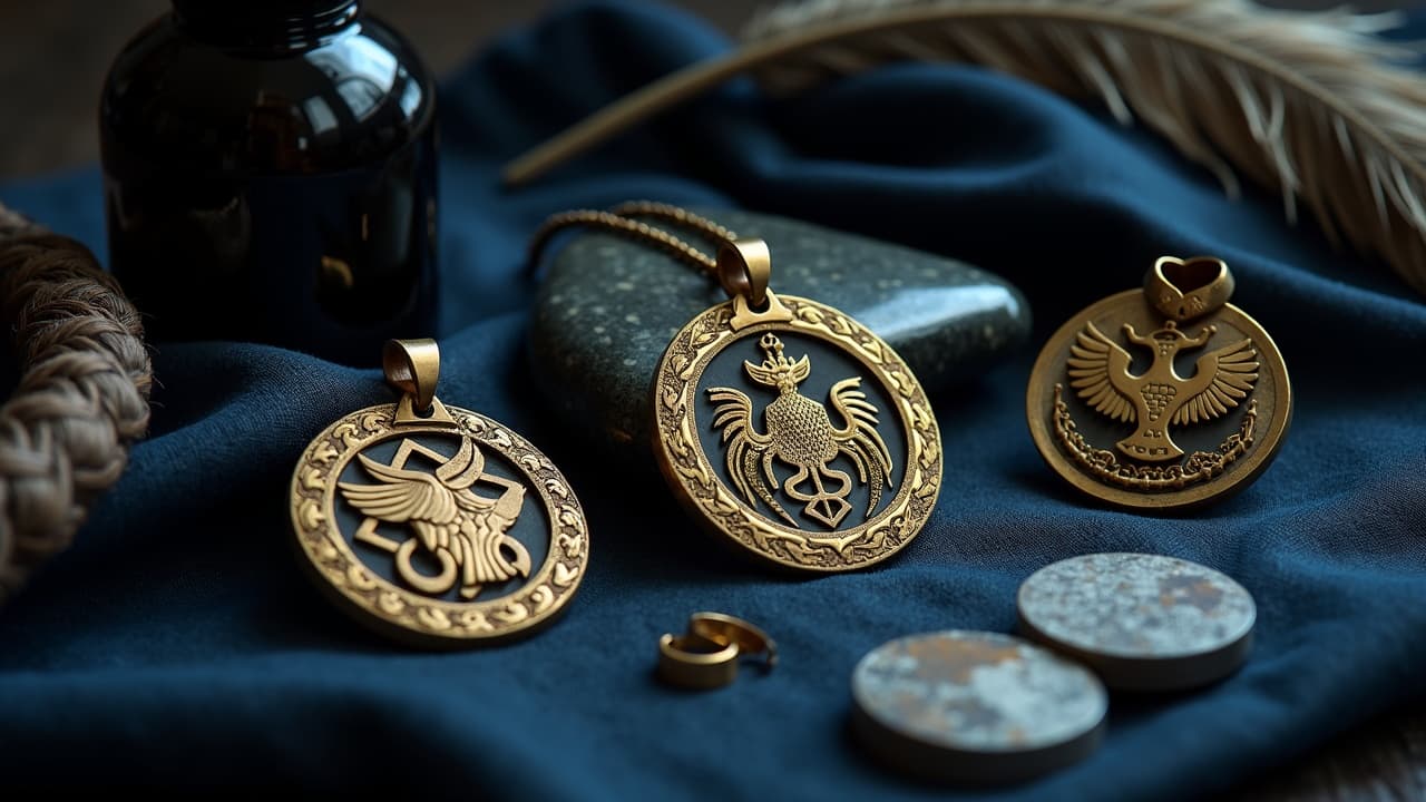
- Dragon, power and guardianship in Chinese and Japanese stories, chaos or greed in parts of European lore. Pair with clouds or waves for protection, hoard elements for Western readings.
- Phoenix, rebirth and resilience, especially strong after health scares or career pivots. Flames and limited warm palettes keep it legible.
- Ouroboros, the snake eating its tail, eternity and cycles. Works as a framing device around dates or names if you want subtle personalization.
- Kitsune, a Japanese fox spirit, trickster wisdom and transformation. Multiple tails imply age and power, so 3, 5, or 9 tails shift the tone.
- Celtic knotwork, interconnection and continuity. Great as pattern scaffolding under animals or to frame a family crest.
- Hamsa or Eye of Horus, protection and warding. Keep geometry crisp so the eye reads at a distance.
- Lotus and mandala hybrids, spiritual growth and clarity, often paired with dotwork to soften the read.
If you are mixing pantheons, make that choice deliberate. A Norse Valknut beside a Greek owl of Athena can read as a statement about war and wisdom as a pair, but only when you control composition and scale. For more nuance on crossings, see our comparative breakdown in this cross-cultural symbolism guide.
Research With Respect: Context, Consent, and Fit
Symbols travel, but communities hold living connections to them. Before you ink a sacred motif, check modern context, talk to friends who carry the culture, and confirm you are not reproducing something restricted to clergy, initiates, or mourning rites. This is basic respect and it also protects you from awkward questions later.
- Do a quick literature sweep, museum entries and reputable summaries beat random blogs. If a motif shows as restricted or ceremonial, skip it.
- Read up on misuses. Our primer on boundaries, tattoo cultural reappropriation, covers common red flags.
- Ask your artist to help localize the work. Swap out costume details, patterns, or flora so the piece reflects the region you intend, not a mashup poster.
- When in doubt, shift from sacred emblems to myth-inspired creatures or abstracted shapes that honor the feel without claiming rites.
Compose for the Body: Flow, Framing, and Negative Space
Myth motifs carry intricate silhouettes. Your job is to make them readable from 3 meters. Think in body lines first, then in details. A dragon along the ribs should ride the oblique curve, a Hamsa on the forearm wants vertical symmetry, a phoenix on the back benefits from triangular wings that echo shoulder blades.
- Set a clear focal hierarchy, one primary shape, one secondary, and supporting texture. Avoid multiple primary shapes that fight.
- Use negative space to carve light around faces, eyes, and sigils. It saves you from packing white ink that can age muddy.
- Frame with geometry. Circles, triangles, or knot borders hold organic creatures and stop the sprawl on arms and calves.
- Control line weights. Thick outer contours plus fine internal lines keep detail safe against softening over 2 to 4 years.
- Test scale with a paper printout or a digital virtual try-on before booking, so curves match your own body.
Pick a Style That Serves the Story
You can render the same symbol in blackwork, neo-traditional, illustrative, fine line, or watercolor and send entirely different messages. The style should amplify meaning and match your maintenance appetite. High-contrast blackwork reads protective and bold, watercolor feels ethereal and personal but needs more sun care.
- Blackwork or geometric, great for ouroboros, Hamsa, and knotwork. Solid blacks age predictably and sit strong on darker skin.
- Neo-traditional, saturated color and bold lines suit phoenix and dragons with readable faces, flowers, and flame shapes.
- Fine line and dotwork, ideal for mandala-lotus builds and delicate celestial symbols. Mind that ultra-fine lines can blur faster at micro sizes.
- Watercolor overlays, soft washes behind a crisp line drawing. Study our watercolor layering techniques to keep contrast.
If you are designing digitally, bake these style choices into your prompts. We itemize brush terms and material cues in our realism prompt guide so your test images match what a coil or rotary machine can actually achieve.
Color That Reads Now and Lasts Later
Color adds symbolic punch, but inks behave under sun and time. Warm palettes make phoenix work pop, cool greens deepen dragon scales, and muted off-blacks keep knotwork elegant. Whatever you choose, plan for maintenance. Dermatology groups remind us that UV is the enemy of saturation, and melanin shifts how pigments show.
- Lean on limited palettes for myth pieces, 2 to 4 inks keep your focal clear.
- Anchor color with bold linework or dark shading so forms do not wash out at a distance.
- For sun protection, daily SPF 30+ broad spectrum is non-negotiable. See the American Academy of Dermatology on sun and skin for basics.
- If you want brights, accept touch-ups every 3 to 5 years. Many artists cite this cadence for neosaturated pieces.
- Know your inks. Regulatory notes on pigments live at the U.S. FDA tattoo inks page. Discuss brands and safety openly with your artist.
On healing and fade risk, large color fields need extra care the first month. Medical sources like the Cleveland Clinic guidance on tattoo aftercare and Mayo Clinic sun protection basics both point to moisture control and UV avoidance as the low-tech wins that keep color. Healthline’s editors routinely track healing timelines and common irritation patterns too, see Healthline’s tattoo care hub.
Placement, Scale, Budget, and Pain Reality
A mythical symbol should meet the moment you live in. If you present at work daily, a ribcage phoenix reads under a shirt, a forearm ouroboros broadcasts. Scale guards detail, so resist cramming a multi-tail kitsune into a 3 cm ankle spot.
- Forearm or calf, balanced for 6 to 8 inch symbols, feels 3 to 5/10 pain for most, high daily visibility.
- Upper arm or shoulder cap, classic for dragons and phoenix, 4 to 6/10 pain, hides under sleeves, expands into sleeves easily.
- Back or sternum, best for wings and geometry. Plan 2 to 3 sessions for larger builds, 6 to 8/10 pain depending on bony areas.
- Ribs and ankles, stylish but sharp. Expect 7 to 9/10 pain for many and slower sessions.
- Budget ranges vary by city, but expect $150 to $400 for small to medium blackwork, $500+ for color pieces that run multiple passes.
If you are mapping a sleeve of mixed myths, storyboard it. Our sleeve planning checklist in this first-sleeve design guide shows how to block anchors, bridges, and filler so the narrative reads from wrist to shoulder.
Runes, Kanji, and Script: When Letters Carry Lore
Letterforms can carry as much weight as creatures. Runes, kanji, ogham, and Sanskrit are not fonts, they are languages or sacred scripts. Spellings, stroke order, and orientation matter. Treat these with the same diligence you would give a memorial date or coordinates.
- Confirm meaning with two independent sources or a fluent speaker. Never rely on a single Pinterest image.
- Print large. 4 cm minimum cap height for complex scripts helps prevent blur. Micro text ages fast.
- Mind direction. Some scripts read top to bottom or right to left. Keep historical orientation unless you intentionally modernize.
- Pair with a symbol carefully, for example Valknut with Elder Futhark can look right but carries heavy associations. Research first.
- Use stencil skin markers to preview curvature so letters do not warp around joints.
From Reference to Original Without Losing the Thread
Myth creatures and emblems are public domain, but a modern artist’s rendition might not be. Build a mood board of sculpture, pottery, textiles, and field sketches. Borrow structures and rhythms, not line-for-line drawings from living illustrators. That way your tattoo feels timeless and no one’s portfolio is lifted.
- Source from museum collections, archaeological plates, and historical textiles. They offer era-correct armor, flora, and ornament.
- Combine three to five references, then redraw. Merge the posture from one, the head from another, and your own line language.
- Avoid tracing contemporary poster art. If you love a living artist’s look, reference style elements and commission a custom design instead.
- Keep a symbol glossary in your project notes so you and your artist agree on meanings before final lines.
Healing and Longevity: Keep the Message Crisp
Line clarity and color saturation are only as good as your aftercare. Fresh tattoos are open wounds, and simple, consistent care beats trendy hacks. Moisture balance and sun avoidance protect both story and skin.
- Day 0 to 5, consider second-skin bandages like Saniderm for the first 24 to 72 hours if your artist approves. Switch to gentle wash and light ointment after. Products like Bepanthen, Aquaphor, or Hustle Butter help early on (non-sponsored examples).
- Week 1 to 3, expect peeling. Keep it clean and moisturized, avoid sun and soaking. Most pieces settle in 2 to 4 weeks, but larger color builds can feel tender longer.
- Long term, daily SPF 30+ over color and black keeps saturation. Revisit for a touch-up at 12 to 24 months if fine highlights fade.
- If irritation or rash develops, pause products and check medical advice. See high-level basics at the Cleveland Clinic and AAD.
If you plan an intense palette or have sensitive skin, bring it up in consult. Patch tests with tiny dots of the intended inks can be placed, then watched. Regulatory background on pigments and safety is outlined by the U.S. FDA.
Preview, Iterate, and Align With Your Artist
The last integration step is alignment. Your body is unique, and your artist’s hand has its own rhythm. Iterate until the symbol, style, and placement all click. Lock the story, then the structure, then the surface details. Most redraws happen in the last 10 percent, not the first draft, so plan time.
- Bring three versions of your idea, maximal, balanced, and minimal. Your artist can merge or tune.
- Print at actual size and tape it on, then take photos from 1, 2, and 3 meters to judge readability.
- Review color on your own undertone. Warm, neutral, or cool skin shifts ink. See our color and shape harmony guide for palette logic.
- Agree on a session plan, lining first, then shading, then color. This keeps meaning legible even if life delays the next pass.
Ready to see how your phoenix or ouroboros actually sits on your arm or ribs? Use AI for Tattoo to generate variants, refine color and line weight, and preview placement on your body. Start with [Create](/create), pull motifs from the [Library](/library), then **try it on** with our camera-based [Try-On](/try-on). Iterate until the myth reads like you.
Try AI for Tattoo Free