Balanced tattoos outlast trends. When shape language and color hierarchy work together, linework reads from across the room and color blocks remain legible even as pigments soften over time. The harmony is not magic, it is planning: values first, palette second, and forms that follow the body. That mix boosts visual appeal on day one and protects clarity after years of wear.
Start With Value, Then Color
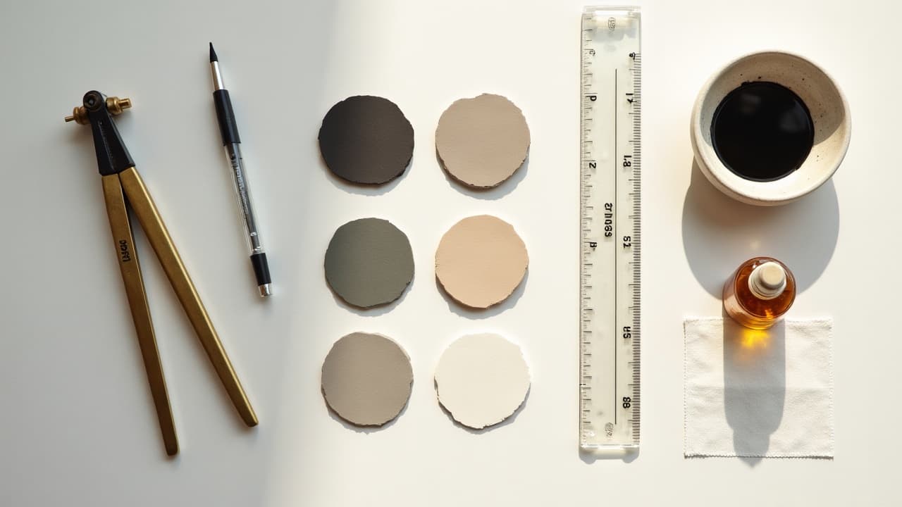
Great color theory tattoo work begins in grayscale. If the value hierarchy is clear in black, it will stay readable when hues fade slightly and skin regenerates. I proof major shapes as a grayscale mockup, then load color only where it reinforces the light–dark plan. Your most important edges are value edges. Saturation is seasoning, not the meal. Reserve your deepest blacks for the focal point and structural outlines, use mid grays to bridge planes, and keep intentional negative space so the design can breathe. Paired with consistent line weight, this prevents color from doing too much heavy lifting.
- Do a quick squint and desaturate test. If forms collapse without color, strengthen the dark-to-light steps and add negative space before picking inks.
- Limit full-saturation areas to your 1–2 focal points, then shift to mid-saturation and skin breaks elsewhere to create depth without clutter.
- Block in black early. A small 5–10 percent increase in black massing can stabilize a palette and keep edges crisp as pigments soften.
- Proof contrast at viewing distance. Step back 2–3 meters and check if the motif reads clearly. If not, simplify shapes or increase value separation.
Color Theory That Works On Skin, Not Paper
Skin is not a white canvas. Undertone and melanin shift how hues show, so calibrate your palette to the wearer. On deeper skin, lean on saturated warms and cools with strong value contrast, rather than pastels that can read muted. On lighter skin, pastels can work when anchored by clean black and mid tones. Complementary pairs, for example blue–orange or red–green, create dependable pop when you balance values. Analogous sets feel calmer but still need a dark anchor. Sun exposure remains a major fade driver, so plan with longevity in mind and educate clients on SPF use. See guidance from American Academy of Dermatology and plain-language notes from Healthline on tattoo fading for why UV, skin biology, and pigment chemistry matter.
- Work with a 3–5 color palette. Primary hue, supporting hue, temperature accent, plus black and the skin tone as a deliberate fifth element.
- Pick complements by temperature. Pair warm reds with cool teal, or golden ochre with violet, then keep one side darker to preserve value contrast.
- Use skin as a color. Reserve 5–15 percent open skin inside the composition for highlights and to prevent colors from stacking into mud.
Shape Language and Flow on the Body
Shapes communicate emotion. Triangles feel dynamic, circles feel calm, rectangles feel stable. On a living canvas, those shapes need to ride musculature, not fight it. Angle triangular motifs along the deltoid sweep, stretch circular elements to elliptical curves on thighs, and let rectangular frames echo forearm bones. Scale and line choice carry the message. Fine lines in a 3RL, structure lines in a 7RL, and fills with 9M or 13M set a clear hierarchy. Repeat angles and radii across the piece to build rhythm, and keep consistent spacing gutters between motifs so colors do not bleed visually.
- Map flow lines first. Trace the spine, deltoid arc, and forearm axis, then align primary shapes to those paths for effortless movement.
- Repeat geometry. If you start with 60-degree triangles, echo that triangle or its negative across borders, backgrounds, and filler textures.
- Taper line weights toward joints. Heavier at the center of the muscle, lighter as you approach bends, to reduce visual congestion when limbs flex.
Building Balanced Focal Points
Most aesthetic harmony tattoos rely on one strong focal and a secondary helper. More than two and the eye ping-pongs. Scale the star element up by 15–30 percent, enrich it with your deepest blacks and most saturated hue, then let supporting shapes carry mid values and softer saturation. Use the rule of thirds loosely. Place the main accent off center, then drive attention with converging lines, repeating shapes, or texture contrast like smooth color fields against dotwork or stipple.
- Define roles: Anchor (largest, darkest, most saturated), Support (medium size and saturation), Connectors (lines, filigree, ribbons, dot gradients).
- Cull micro-focals. If every petal has a highlight and outline, nothing leads. Merge details into value groups so clusters read as one.
- Protect breathing room. Maintain 3–6 mm skin gutters around anchor shapes to preserve silhouette clarity over time.
Palette Longevity and Ink Choices
Not all pigments age equally. Carbon black is the stability king, blues and greens with inorganic bases often hold well, while some light reds and yellows can shift faster in the sun. The U.S. FDA on tattoo inks notes variability in pigment composition, and clinical overviews in JAMA Dermatology discuss adverse reactions, especially in certain reds. Pair chemistry with design: keep fragile hues in smaller accents and reinforce edges with black. Longevity also lives outside the bottle. UV protection and good healing preserve chroma. Recommend SPF 50+ daily on healed work and hydration during healing. For aftercare films and balms, I have seen reliable results with Saniderm, Derm Shield, Aquaphor, Bepanthen, Hustle Butter, and Mad Rabbit (non-sponsored examples). For medical-grade skincare and UV risk education, see Mayo Clinic’s skin health resources.
- Use black keylines around pale colors so edges stay readable as chroma drops with time.
- Reserve fragile pastels for small accents or interior shapes, not outer silhouettes that define the read.
- Preach sunscreen. Suggest SPF 50+, broad spectrum, water resistant, reapplied every 2 hours outdoors for healed tattoos.
Harmony Across Styles, From Watercolor to Geometric
Different styles demand different balance moves. In watercolor, hue edges are soft and value is king, so you need a black scaffold or shape cutouts to keep the image from turning to haze. Our breakdown on washes and edges in watercolor layering techniques shows how to stack transparencies without losing form. In geometric and dotwork, pattern repetition risks monotony. Stagger scale, mix dot density, and slice in a contrasting shape family, for example circles interrupting hex tiling, so the piece breathes. Hybrid styles often sing when one system leads and the other supports.
- Watercolor plus line art: anchor soft washes with clean 7RL outlines on key forms, then let inner planes stay line-free for glow.
- Geometric plus organic: pair a hex grid with a flowing animal or floral silhouette, merging at the midline with dot gradients.
- Neo-trad realism: keep 3–5 inks per object and unify the palette with a repeating background tone, for example muted teal shadows.
Scaling for Small, Medium, Large Designs
Scale determines palette, line, and detail. Small tattoos sacrifice micro-detail for silhouette clarity, which means bolder shapes and fewer colors. Medium pieces are the sweet spot for shape and color balance, big enough for hierarchy but compact enough to finish fast. Large projects need pacing, with clear focal zones and repeating motifs that tie panels together over sessions. If you are choosing size, study our sizing notes and time planning tips in the medium-size tattoo guide. Budget and pain tolerance also gate scope, so plan shape and color choices to match session length.
- Small, under 3 inches: one focal, 2–3 inks plus black, thicker lines. Typical cost $100–$250, session 30–60 minutes.
- Medium, 4–8 inches: two focal zones, 3–5 inks, mid and bold lines. Typical cost $300–$800, session 2–4 hours.
- Large, multi-panel: modular anchors and repeating shapes, limited master palette. Costs stack per session $500–$1,200, multiple sits for healing and review.
Planning Sessions and Healing Without Color Shift
Healing can tilt colors if scabs thicken or flakes lift pigment. Gentle film dressings and thin moisturizers prevent over-drying. I like Saniderm for the first days, then switch to Bepanthen or Aquaphor in thin layers, never greasy. Athletes or outdoor workers should look at our aftercare for active lifestyles. Style-specific tips live in the aftercare by tattoo style guide. Do not rush color packing in one mega session if the skin is inflamed. Inflamed tissue rejects ink, and stacking hues into irritated skin muddies edges. Split color-heavy work into 2–3 sittings, let top layers calm, then glaze new tones cleanly.
- Day 0–1: clean, dry, then apply second-skin film. No heavy lotions, no gym, no swimming.
- Day 2–4: switch to thin fragrance-free ointment twice daily. If ooze builds under film, change it with clean hands.
- Day 5–14: light, unscented moisturizer, no picking. Start SPF 50+ on short exposures once the surface is fully closed.
Test, Iterate, Try-On Before You Commit
Harmony is designed, not guessed. Print the stencil at scale, mock up color in grayscale first, then add hue. Photograph the body part and overlay the design to check flow and focal read at distance. Digital tools speed this feedback loop. Explore palettes, rotate shapes, and preview placements until the design clicks. For workflow ideas, see our quick wins in the AI prompt iteration guide and decision tips in the artist portfolio analysis guide.
- Build two versions: one high-contrast, one low-saturation. Compare readability at arm’s length and in room light.
- Stress test the silhouette. Fill everything black and check the shape alone. If it is strong, color will elevate it, not carry it.
- Try on virtually. Use accurate skin tone photos and preview 1–2 sizes to see how color and shape breathe with anatomy.
Ready to proof your color and shape balance before you book? Generate variations and preview placements with AI for Tattoo. Build a **3–5 color** palette, refine focal points, then [create](/create) and [try on](/try-on) your design in minutes. Browse references in [our library](/explore) to spark balanced compositions that fit your body.
Try AI for Tattoo Free