
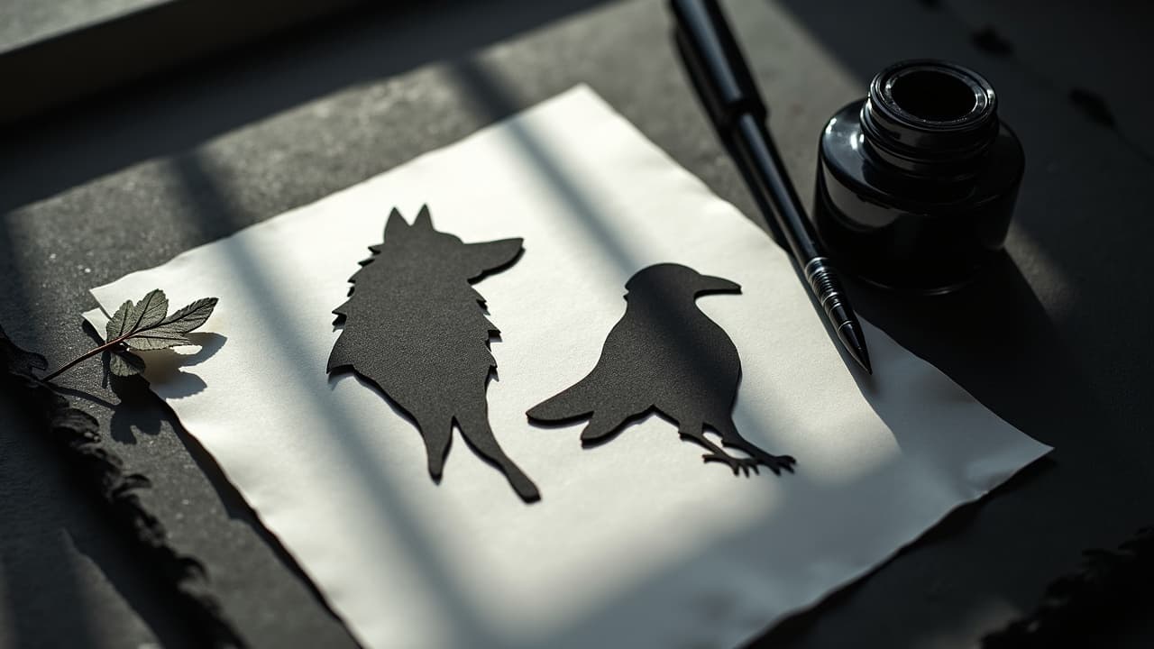
Silhouette tattoos hit harder than most styles because a clean shape reads from several feet away, even in low light. When you plan for negative space, bold shape hierarchy, and edge clarity, you get impact that survives both distance and time. The surprise is that the most dramatic silhouettes are less about more black ink and more about how you reserve skin tone to do the heavy lifting.
Readability First: What Makes Silhouettes Hit Hard
Every strong silhouette tattoo starts with legibility. Think of it as a poster on skin. You want a simple, recognizable figure, a secondary support element, then everything else falling back. On living skin, light shifts and pores scatter edges, so design your core shape to read at 2–3 meters, not just at selfie distance. Build the big forms first, then audition detail only if it does not break the read.
- Run a “3-second test.” Squint at the design for three seconds from arm’s length. If the subject is not obvious, simplify the contour or enlarge the focal mass.
- Check the silhouette at 10%, 25%, and 100% zoom in your mockup. If it fails at 10%, the tattoo will flatten at distance on skin.
- Prioritize one dominant direction of movement. If your figure faces left, echo that with hair, cloak, or branches leaning left, so the silhouette flows as a single gesture.
Designing With Negative Space, Not Against It
Silhouette work is the purest form of carving light from dark. Treat skin as an active medium, not empty background. Hard black works best when it is balanced by crisp voids, halo cuts, and air around the subject. If your layout feels crowded, remove ink, not add it. For deeper tactics, bookmark our advanced negative space guide.
- Use a halo separation of 2–4 mm around the main shape to prevent neighboring elements from fusing after healing.
- Carve interior cut-ins for identity points, like a wolf’s ear notch or a violin bow, but keep them large enough to survive softening over 5–10 years.
- Stage light-on-dark overlaps. Place a pale moon cutout behind a black figure so the head and hands have clean separation lines.
- Reserve breathing room. Aim for at least 25–35% open skin in the composition so the black masses feel intentional, not muddy.
Scale, Placement, and Body Landmarks
Silhouettes love curved real estate. Wrapping them over a muscle belly adds motion without adding lines. Place the focal edge, like a bird’s beak or a dancer’s hand, where the eye naturally rests, such as the mid-forearm or the apex of the calf. If you are weighing options, skim how to choose the right placement.
- Forearm outer, medium pain 3–5/10: Great for 4–6 inch vertical silhouettes. Keep the long axis parallel to the radius bone for a natural flow.
- Calf outer, low to medium pain 3–6/10: Handles 6–9 inch figures well. Let the silhouette ride the gastrocnemius curve for built-in drama.
- Upper arm, low pain 2–4/10: Ideal for medallion-style silhouettes with circle or oval frames. Avoid crowding near the armpit fold.
- Ribs, higher pain 6–8/10: Save for simplified shapes with thicker edges. Breathing motion can skew stencils, so lock in landmarks during setup.
- Back shoulder blade, low to medium pain 3–5/10: Big canvas for negative halos and environmental cutouts like trees, cliffs, or skyline arcs.
Edge Language: Crisp, Soft, and Broken
A silhouette is not only a black fill. The character of your edges tells the story. Use crisp contour lines where identity lives, like faces or hands. Move to soft or broken edges in trailing hair, fog, or dust to suggest motion. On the technical side, I like a 9RL or 11RL for outlining key contours, then a 9M or 15M for fills and feathering. On tiny work, a tight 5RL can still hold if you avoid micro sawtooths and overworking the skin.
Feathered edges are your friend. Pull a short whip to break up straight lines that would otherwise look sticker-flat. In forest scenes, puncture the silhouette with tapered negative twigs. On portraits, carve a split highlight along the jaw or cheek to lift the face from the neck mass. Avoid symmetrical edge noise on both sides, which makes the piece feel busy and robs the main read.
Micro‑Detail Inside a Silhouette Without Killing the Read
You can hide a lot inside a silhouette if contrast is staged. Think of interior detail as shadows within a shadow. Use 1–2 values of diluted black or dense stipple to hint at fabric folds, fur flow, or rock texture. The rule is simple, if a mark does not serve form or storytelling, remove it.
I often place keyhole windows inside the silhouette, like a small lighthouse beam cut through a sailor outline. Another trick is texture directionality. Stipple along the contour to curve a cape inward, then flatten the ground with cross-grain dots so the figure pops forward. Keep all micro forms subordinated, about 30–40% lighter than the contour so the edge still rules.
Frames, Ground, and Atmospheric Tricks
A floating silhouette can feel unfinished. Give it context with a frame or ground line. Circles and ovals stay timeless and survive aging nicely. You can also use geometric frames to compress busy landscapes into readable shapes. Finish with gentle atmospheric cues so the black has a place to live without crowding the star of the show.
- Circle or crescent frames: Great for moonlit scenes. Leave a 1–2 mm halo between frame and subject for separation.
- Horizon bars: A thin baseline under a standing figure anchors the weight and reduces the chance of the silhouette drifting visually.
- Stipple gradients: Fade a dot field from dense underfoot to open above the head to create depth without lines.
- Foreground break-ins: A few negative blades of grass or a fence post in front of the figure create parallax without stealing focus.
Ink Choices, Contrast, and Long‑Term Look
For silhouettes, ink choice matters less than technique, but good bottles help. I reach for Dynamic Triple Black, Eternal Maxx Black, or World Famous Blackout for fills, and Empire Greywash for interior soft work (non-sponsored examples). Pack your blacks deliberately, working in small tiles to avoid chewed skin. Keep wipes gentle so you do not lift corners of the halo cuts. Sun will be your biggest enemy. The American Academy of Dermatology advises daily broad-spectrum SPF 30+ on tattoos to limit fading and protect healing skin. See the AAD’s sunscreen guidance at aad.org.
If a client has a history of pigment reactions, avoid large red or yellow fields near your silhouette overlays. The Mayo Clinic notes that allergic reactions can happen with certain pigments, particularly red, which can complicate healing and touch-ups. Read more at mayoclinic.org. Also remember that tattoo inks are not FDA approved the way drugs are. The FDA provides consumer information on tattoo inks and reports of adverse events, including contamination concerns, at fda.gov. For deeper clinical reading, scan JAMA Dermatology coverage of pigment reactions and photo changes at jamanetwork.com/journals/jamadermatology.
Stencil, Execution, and Healing for Crisp Results
Clean silhouettes live or die on setup. Degrease well, shave wide, and use a stencil transfer you trust. I like Stencil Stuff, Electrum, or Spirit Classic Freehand paper, then I ghost the halo and key cut-ins so I do not overpack later (non-sponsored examples). During fill, keep your stretch consistent and slow your passes. Build your blacks in two controlled layers instead of one frantic scrub. The goal is saturated ink with minimal trauma so edges heal sharp.
- Cover with a breathable film like Saniderm for 3–4 days, then switch to a light ointment such as Hustle Butter, Bepanthen, or Aquaphor for 10–14 days (non-sponsored examples).
- Avoid soaking. Showers only for 2 weeks, no pools or baths. Waterlogging softens edges and can lift micro cut-ins.
- Moisturize thin, not shiny. A whisper-thin coat 2–3 times daily keeps flaking even so you do not scuff the halo lines.
- Book a 6–12 week check-in. If a soft edge lost too much contrast, map a tiny touch-up. See our touch-up guide.
Story, Symbol, and Collaboration
Silhouettes carry emotion without facial detail, which is why they make strong memorials and mythic scenes. Pair subject and setting with intention, a running child inside a woodland frame, a stag on a ridgeline at last light, a loved one’s profile cut from a favorite city skyline. Translate the story into repeatable shapes so it still reads decades later. If you need help translating ideas to visual language, tee up prompts with our AI prompt guide, then refine with your artist’s hand.
Before you commit, print the mockup at real size and tape it in place. Photograph from three angles and at 2 meters to confirm the read. Small edits now, like enlarging the head mass or opening a halo by 1–2 mm, can save the design from fusing after healing. The cleanest silhouettes are not accidents, they are rehearsed compositions tuned to the body.
Want to see how your silhouette reads on your own skin at real scale before you book time? Use AI for Tattoo to generate variations, adjust negative space, and preview placement with our virtual try-on. Start a design in minutes at Create, then check legibility instantly on your body with Try On. Or scan ideas by style at Explore and Styles.
Try AI for Tattoo Free