
Most AI models are trained on modern illustration, so without tight direction they miss vintage tattoo cues like limited palettes, bold outlines, and era-correct composition. The fix is simple, specific prompt language that instructs color, line, layout, and texture the way a flash painter would. This guide gives you the exact phrases and structures that consistently yield old-school Americana and traditional Japanese looks, plus templates you can copy, edit, and test.
What “vintage” means in tattoo prompts
Vintage is not a vibe tag, it is a set of constraints. An old-school Americana eagle works because of thick black lines, 5–7 flat colors, simple shading, and a poster-like composition. Traditional Japanese, often labeled Irezumi, reads authentic when you control flowing linework, ukiyo-e palettes, negative space clouds, and patterned fills. On skin, these limits are functional, not aesthetic snobbery. Bold outlines age better, and restricted hues reduce muddy heals. The American Academy of Dermatology notes that certain pigments, especially reds, carry higher reaction risk, which is another reason classic palettes leaned on durable blacks and muted secondaries AAD overview on tattoo reactions.
The anatomy of an effective vintage prompt
Think like a stencil maker. Give the model a clear subject, then lock the look with seven parts you can reuse in any prompt: subject, style, palette, line weight, shading, layout, and texture. A working structure looks like this: subject + style tag + palette + line and shading + layout and motifs + texture and medium + output constraints. Small additions, like “aged paper grain” or “halftone dots”, do a lot of heavy lifting to avoid glossy gradients. For consistency across a set or sleeve, add a shared seed or style clause and keep your language order stable. See our AI prompt consistency tips if you are building a multi-piece project.
Controlling palette like an era‑correct artist
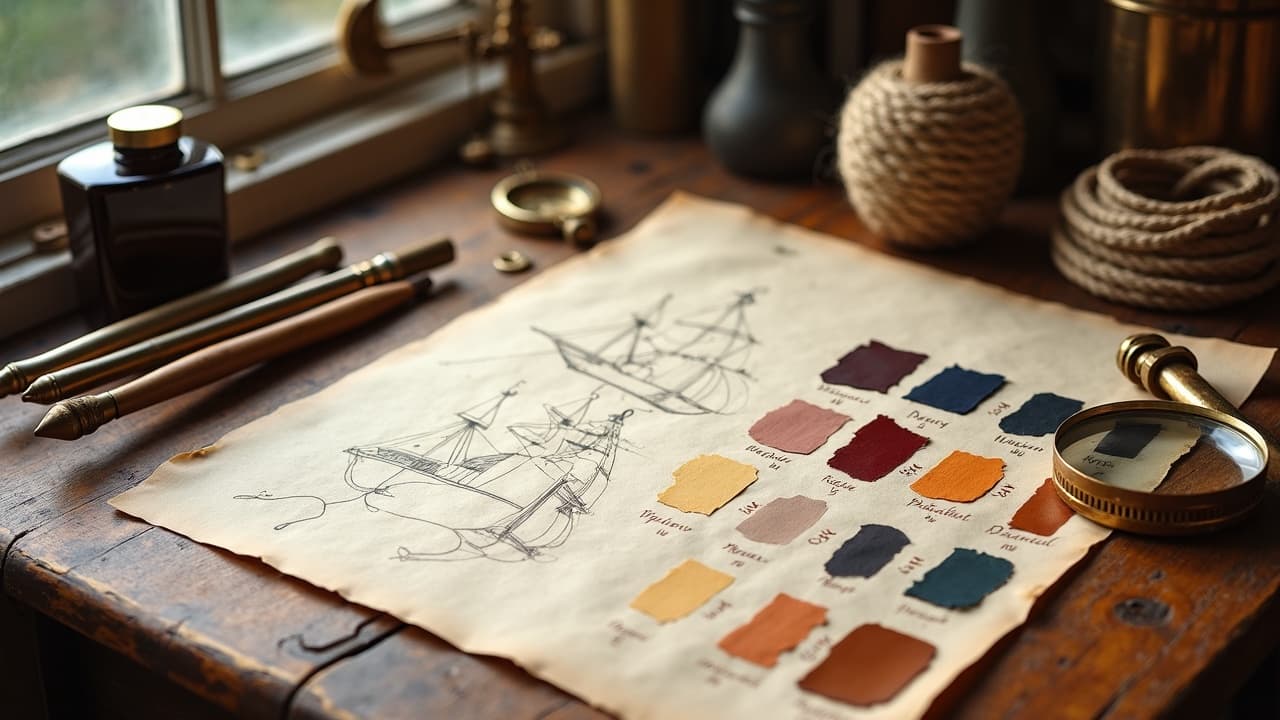
Old-school flash used few inks because early pigments were limited. You can mimic that with explicit HEX codes, ink names, and words like “flat fill” and “no gradients.” A simple sailor set might be black, muted brick red #8B2E2E, mustard #C7A438, sea green #2C6E49, and sky blue #3A7CA5. Japanese palettes favor sumi black, indigo, vermilion, and bone-toned negative space. The FDA’s overview of tattoo inks and pigments is useful context for why color permanence varies by chemistry FDA on tattoo inks. Two more tips. First, specify “paper-white highlights only” to stop the model from spraying chrome-like shine that does not exist in vintage flash. Second, call skin context early, for example “designed for medium skin tone, high contrast, muted red usage”. If you are planning color mixes for real skin, review our color contrast guide to keep your palette readable at three feet.
Line weight, shading, and texture that read old
Nothing says modern like airbrushed shadows. Classic tattoo looks are built from bold outlines, tidy hatching, and solid blacks. In prompts, translate machine choices into language the model recognizes. For Americana, cue “bold 5–9 RL outline, minimal whip shading, solid black pack”. For Japanese, cue “tapered brush line, sumi wash gradients, crisp negative space”. When you want printed-vintage texture, mention “risograph grain,” “aged paper fibers,” or “screenprint halftone 15–25 LPI.” Health sources also remind us why black-heavy designs age well, with fewer allergen issues compared to bright reds and yellows, a point echoed in consumer coverage from Healthline on tattoo aftercare and risks.
- Use line language the model maps to tools, like “bold liner, 5–9 RL, single pass look, tight corners” for classic flash feel.
- For etched or woodcut looks, add “crosshatch, wood engraving, stipple texture, no soft airbrush” and cap the dot size, for example “0.3 mm stipple.”
- To avoid plastic shine, include “matte ink finish, paper tooth visible, no specular highlights” in the texture clause.
- When you need depth without gradients, say “two‑tone shading, hatch density 30–70 percent” and keep color count under 6.
Layout rules that make it look printed, not 3D
Vintage tattoo art reads like a poster, not a render. Tell the AI where the eye should land, then support it with banner, border, and fill rules. Americana loves central medallions, ribbon banners, and rope or star borders. Japanese work respects flow lines, panel rhythm, and ma, that is planned emptiness. Name your frame and fills so the composition does not sprawl into 3D space. If placement matters, mention it, for example “forearm vertical format, fits 18 cm height, oval crop.”
- Composition starter, “central subject 60 percent canvas, banner 20 percent, background motifs 20 percent, no perspective depth.”
- Americana fillers, “stars, dots, rope, leaves, water drops, no photoreal smoke” keep the flash wall energy.
- Japanese flow, “kumo clouds, botan flowers, repeating wave seigaiha, asymmetry left to right” maintains sleeve rhythm.
- Add aging cues, “off‑register print, ink spread at edges 1–2 px, paper discoloration at corners,” for a finished vintage read.
Ethically referencing artists and sources
You can honor a lineage without copying living artists or protected flash. Avoid direct “in the style of [artist]” calls. Use era and medium instead, for example “mid century sailor flash, rotary era line quality, acetate stencil look.” For Japanese work, reference ukiyo‑e woodblock aesthetics and regional schools rather than a single master. If in doubt, or when building client work, review our responsible AI use guidelines. For health and safety context, the Cleveland Clinic and AAD both publish accessible overviews on tattoo complications that can inform color and placement choices even at the prompt stage Cleveland Clinic skin safety overview, AAD overview on tattoo reactions.
Prompt templates for key vintage styles
Copy these, then tune subject nouns, palette hexes, and dimensions. Keep the order stable for repeatability. Old‑school Americana flash, subject swap ready: “bold old‑school tattoo flash of a [subject], thick black outline 5–9 RL, flat fill colors, black #000000, brick red #8B2E2E, mustard #C7A438, sea green #2C6E49, sky blue #3A7CA5, paper‑white highlights only, ribbon banner with hand‑lettering, star and dot fillers, no gradients, matte ink finish, risograph grain, off‑register print edges, stencil‑ready line clarity, 300 dpi, vector‑friendly shapes.” Traditional Japanese, compact panel or patch: “traditional Japanese tattoo of [subject], sumi black line and wash, tapered brush line, ukiyo‑e palette, indigo, vermilion accents, bone white negative space, kumo clouds and botan fillers, asymmetrical flow left to right, no photoreal textures, woodblock grain, paper fiber specks, sleeve‑friendly curve awareness, high contrast, crisp flat tones.” Art Deco monoline badge, for vintage minimalists: “art deco tattoo emblem of [subject], monoline 3–5 RL, geometric symmetry, limited palette, black and antique gold #C4A657, enamel pin look without gloss, poster flat fills, halftone 20 LPI shadows, circular border, 1 mm gap to edge, 300 dpi.” Engraving or woodcut blackwork, for historical flair: “vintage woodcut tattoo of [subject], dense crosshatch and stipple, no soft gradients, solid black pack, 0.3 mm stipple dot, engraving contour lines, paper tooth visible, high contrast, rectangular panel, minimal background, stencil clear at 1.5 mm line spacing.” If you build sets, keep a shared clause like “same palette and texture as previous” and reuse the exact hex codes. That keeps sleeves coherent without micromanaging every variable.
Troubleshooting AI quirks and iterating quickly
Vintage prompts occasionally drift modern. Catch it early and correct with hard constraints. When a model adds chrome shine, ban it with “no specular highlights” and reassert “matte ink.” If gradients sneak in, restate “flat fills only”. If composition goes 3D, add “orthographic view, no perspective” or define a border. For multi image projects, keep a change log and vary only one clause per iteration. If you find a stable seed or style token, document it, then apply it across the set. For repeatable results across days or models, see AI prompt consistency tips.
- Symptom, plastic gloss. Fix, add “matte finish, paper fiber texture, no specular highlights” and remove any “3D render” language.
- Symptom, airbrush blur. Fix, “no airbrush, crosshatch or stipple only, flat wash shading” and cap colors to 5.
- Symptom, weak outline. Fix, “bold outline 5–9 RL, uniform stroke, stroke expansion 1–2 px” and increase black usage.
- Symptom, modern palette drift. Fix, lock hex values, “use only listed colors, replace others with black”.
From screen to stencil, prepping AI art for skin
A convincing AI mockup still needs tattoo‑ready lines. Export 300 dpi at print size, then clean edges and unify line weights. In Illustrator, Image Trace on Black and White Logo with Paths and Corners turned up gives crisp vectors. In Procreate, use Threshold in Selection to harden edges before printing a stencil. Respect body flow using templates, and if you are planning a sleeve, map panels before finalizing art. Our guide on customizing your design for your body shape helps you translate flat art to curved anatomy. For client previews, quick mockups on forearm or calf photos reduce surprises. Align with a solid consult, like the steps in our tattoo consultation guide. When you reach the real session, standard aftercare still applies. If color testing is part of the plan, remember that reds can trigger more reactions than blacks or blues, a pattern discussed by the American Academy of Dermatology and explored in clinical literature from JAMA Dermatology JAMA Dermatology journal. For general health guidance on tattoo care and risks, review the FDA and Healthline resources cited above.
Ready to see your prompt in ink? Use AI for Tattoo to generate vintage‑true designs, then place them on your body with a live preview. Start with a template here, edit the subject, and try it on instantly. Create now at AI for Tattoo Create, then preview placements with Virtual Try‑On.
Try AI for Tattoo Free