
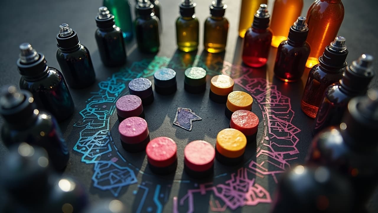
The fastest way to make an AI tattoo draft look expensive is not more detail, it is smarter color. Value contrast, palette harmony, and skin tone matching decide whether a concept reads at a glance or muddies out after healing. Good news, color theory translates cleanly into prompt language. With a tight color brief and a few guardrails, you can make AI output that an artist can actually stencil and saturate.
What AI gets wrong about color, and how to outsmart it
AI loves eye candy, which is why it often pushes neon gradients, low-contrast pastels, and white ink on dark fields. Those look great on a backlit screen, then disappear on healed skin. Your fix lives in the prompt. State the palette, value hierarchy, and ink realism upfront, then forbid problem moves like pure white fills where they will not hold.
- Name the finish: “tattoo design, pigment-realistic, no glow effects, no metallics, matte ink appearance”.
- Block bad contrast: “maintain dark linework key, avoid pastel on light skin, avoid white ink fills except tiny highlights”.
- Tell it to respect skin: “simulate on Fitzpatrick IV warm olive forearm, adjust palette for visibility on that tone”.
- Force readability: “test at small size, legible at 3 to 5 meters, simplify background with negative space”.
Build a color brief inside your prompt
Treat your prompt like a mini creative brief. Define hue families, temperature, and the job of each color. When AI knows what is primary, secondary, and accent, it stops guessing and starts composing. I like to include CMYK percentages or hex codes for hero colors, then a target saturation 60 to 75 percent so the palette does not scream on day one or wash to gray by year three.
- Palette: “limited palette, analogous blue–teal–green, accent coral, hex #0F7A8A, #27AE60, #FF6F61”.
- Hierarchy: “primary teal for focal petals, secondary forest green for leaves, accent coral for two highlights only”.
- Temperature: “overall cool temperature, warm accent for focal pop”.
- Value plan: “value-first design, strong mid to dark values, light reserved for highlights, no flat tints over large areas”.
- Saturation: “keep colors mid-chroma, no 100 percent saturation, slight desaturation in background”.
Example full prompt spine you can adapt: “ornamental peony tattoo design, pigment-realistic, limited analogous blue–teal–green palette with coral accent, value-first shading, black key lines, mid-chroma saturation 65 percent, legible at distance, no glow, negative space background, mock on Fitzpatrick III neutral inner forearm.”
Skin tone aware color planning that actually heals readable
Skin is not a blank canvas, it is a filter. On Fitzpatrick I to II skin, pastels can read, but you still need black anchors to prevent haze. On Fitzpatrick IV to VI, deeper value and saturated mid-tones beat chalky pastels every time. The American Academy of Dermatology notes that sun exposure and melanin impact how tattoos look over time, and consistent SPF 30+ protection helps preserve color American Academy of Dermatology.
Build the tone into your prompt and you will get more honest previews. Ask the model to simulate on an arm photo close to your tone, or specify the Fitzpatrick number and undertone. Avoid large white fills on darker skin, they often heal translucent. Use lightest lights as controlled highlights, not fields.
- Fitz I–II cool or neutral, go muted pastels with strong black linework, keep backgrounds minimal.
- Fitz III–IV warm olive, pick teal, emerald, maroon, burnt orange, skip powder blue unless it is just a highlight.
- Fitz V–VI, lean on royal blue, magenta, gold, emerald, reserve white for micro highlights, glaze lights over black shading for luminosity.
Allergic reactions to certain pigments can happen, especially reds. Check your artist’s pigment safety sheets and review the U.S. FDA tattoo inks overview for general guidance on pigments and labeling U.S. FDA tattoo inks overview. If you have a history of reactions, patch test or shift hue families to safer options.
Harmonies that read on skin, with prompt templates
Classic harmonies still work, you just need to weight values and linework. Below are field-tested pairings with quick prompt clauses you can paste into any generator. Keep black as your constant, then layer color like glazing, not wall paint.
- Complementary pop, “complementary palette teal and coral, black line key, teal midtones 70 percent, coral only for focal petals and highlights”.
- Split complementary balance, “split complementary magenta with teal and mustard accents, mid to dark values, no light pastel floods”.
- Analogous calm, “analogous indigo–blue–teal, black contour lines, desaturated background, lightest values limited to edge highlights”.
- Triadic energy, “triadic violet, green, orange, violet dominant 60 percent, green 30 percent, orange 10 percent accent only”.
- Monochrome with accent, “monochrome blue range, one gold accent for jewelry elements, maintain strong black shading for depth”.
Lead with value, then layer hue in your prompt
If the design reads in grayscale, it will sing in color. Tell the AI to generate a value study first, then colorize. You can even specify a 1 to 10 value scale emphasis, such as 3, 6, 9, so your darkest darks and lightest lights are not accidental. This stops low-contrast mud before it starts.
Prompt sample: “start with grayscale value map, black key lines, darkest shadows at value 9, mids at 5 to 6, lights at 3, then apply analogous teal–blue palette mid-chroma, keep highlights minimal and warm.” For more structure tools, see our silhouette composition techniques.
Control saturation and chroma for longevity
Even perfect palettes fade. Sun and time lower saturation, which is why pushing everything to 100 percent on day one backfires. The Cleveland Clinic underscores that UV exposure accelerates tattoo fading, so daily SPF 30+ on healed tattoos is non-negotiable Cleveland Clinic. Reds and yellows may shift faster than blues and blacks according to multiple dermatology sources, so design with that in mind Healthline.
- Set a ceiling, “keep saturation 60 to 75 percent on fills, reserve near-100 percent only for tiny accents”.
- De-emphasize backgrounds, “background colors 30 to 40 percent saturation, to avoid competing with subject”.
- Ask for pigment realism, “simulate tattoo ink pigments, no digital glow, soft transitions as if stippled or whip shaded”.
If you need a neon vibe, fake it with contrast, not pure chroma. A dark surround and a warm highlight can read neon without asking your artist to pack risky fluorescent pigments. For ink selection and skin safety, read how to choose the right tattoo ink for your skin type.
Contrast, background control, and read distance
Most regret designs do not fail on art, they fail on readability at size. Every prompt should address background compression and negative space. If the subject and the background share value, the tattoo looks busy and flat. Ask the AI to proof at distance and simplify until the silhouette pops.
- Silhouette first, “clear silhouette, high value contrast, background pushed to two values darker or lighter than subject”.
- Negative space, “reserve clean skin breaks around focal edges, no full-bleed gradients behind the subject”.
- Distance check, “render a small preview, legible at 3 to 5 meters, reduce detail until primary forms read”.
Linework anchors, black keys, and needle reality
AI forgets needles exist. Tattoos need black key lines, weighted to fit style and placement. Tell the AI what line weights you want so your artist is not inventing structure later. In fine line pieces, black shading and stipple still do the heavy lifting for depth. In traditional, bold outlines and spot blacks do the job.
- Set weights, “primary contour 1.2 to 1.5 mm, secondary 0.6 to 0.8 mm, micro detail 0.3 to 0.4 mm”.
- Spot blacks, “add spot black shapes in deep recesses, no flat black over textures”.
- Shading method, “prefer pepper shading or soft whip, avoid airbrush looks, maintain texture as stipple”.
You can even ask for needle-friendly simplification: “reduce micro-parallel lines to 6 to 8 per cm, avoid hair-thin crosshatching”. This keeps your fine lines from merging after healing. For personalization frameworks beyond color, see our AI tattoo prompt development guide.
From screen to skin, proofing, and color care
Before you commit, print the design at 100 percent on regular paper. Step back 3 to 5 meters. If it reads, you are close. If it does not, adjust value or background. Once inked, color care is basic but relentless, sunscreen and moisturize. The American Academy of Dermatology and Cleveland Clinic both emphasize daily sunscreen to slow fading American Academy of Dermatology Cleveland Clinic.
- Aftercare basics, fragrance free moisturizer like Bepanthen, Aquaphor, or Hustle Butter and sterile film like Saniderm in the first days, follow your artist’s protocol (non-sponsored examples).
- Long-term care, SPF 30+ or higher, reapply every 2 to 3 hours outdoors. Products like Mad Rabbit Defend SPF 50 or any broad-spectrum SPF work fine (non-sponsored examples).
- Touch ups, plan on a 1 to 3 year check in for high exposure spots. Budget $50 to $150 for small refreshes, more for large color fields.
If you want a color-safe numbing option for larger sessions, ask your artist first. Some creams can thin skin or affect stencil. When approved, products like TKTX or Zensa are common picks, applied exactly as directed (non-sponsored examples). For irritation, the FDA maintains consumer guidance on tattoo reactions U.S. FDA tattoo inks overview. For aftercare pitfalls, see our guide on tattoo aftercare mistakes.
Ready to see your palette come alive on your own skin tone? Use AI for Tattoo to generate designs with controlled palettes and value plans, then preview at size with our virtual try on. Start a color brief in seconds in Create or test visibility on your arm in Try On.
Try AI for Tattoo Free